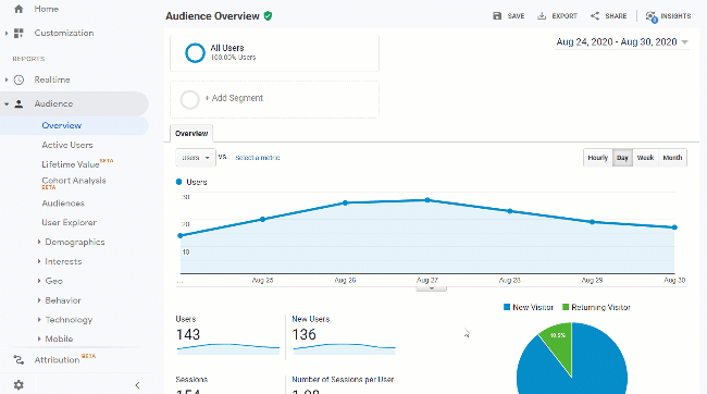
There are two types of data you can collect on your website, qualitative data and quantitative data. Quantitative data includes numerical values and qualitative data includes observed or reported feedback. When these two data types are combined you can better understand how your site can be improved. Let’s go over how to collect qualitative and quantitative data on your blog.
Qualitative vs Quantitative — What’s the Difference?
Qualitative Data
Qualitative data is genuine feedback. It is more than just a number. It is an observed or reported experience. This type of data is often expensive, time consuming, and difficult to analyze. But, it can provide a deeper understanding and help you understand the why behind the numbers you’re analyzing.
Quantitative Data
Quantitative data is measured with numbers. It’s easy to analyze but can be difficult to understand underlying causes or why the numbers look how they look.
Why Use Both Qualitative and Quantitative Data?
When you use both qualitative and quantitative data you can create a clearer picture and sometimes solve mysteries.
Reviewing only quantitative data oftentimes raises more questions than it answers. When you combine it with qualitative data it can help you understand why you see the quantitative data you see.
The quantitative data can help you assess qualitative observations to understand where to focus your efforts. Sometimes qualitative data can uncover a problem, and then you can refer to quantitative data to determine how large of an issue it could be and if it seems many people experience the problem.
You can also do the reverse. If you find an issue with the metrics you’re reviewing in your quantitative data, you can get more information by running some qualitative tests in related areas.
Combining the two types of data is how you’ll be able to create clear data stories and uncover the complete picture.
How to Collect Qualitative and Quantitative Data
Okay, so now we understand the difference between qualitative and quantitative data, and we understand why we need both. Now, let’s go over some of the different sources you can use to actually gather the data on your website.
Qualitative Sources
Interviews
One way that you can get qualitative data is from interviews. Interview members in your community. If you have an email list or a facebook group you can reach out to your community and select a few people to interview.
Surveys
Surveys are a popular way to get qualitative data. Specifically, open ended questions in surveys. These questions give people the ability to give specific and detailed feedback.
To collect survey responses from your existing audience you can use Google Forms. It’s a free and easy tool to create a survey. Then, you can share the link with your email list and social networks.
You can also collect survey responses from website visitors. This is a fun way to do it because you get feedback from people who you otherwise may never hear from. You can create a survey so it triggers when someone is about to leave the site and then ask them why they choose not to complete the purchase.
You can also add a survey to your website to ask just a real simple question to all visitors. You can ask how likely they are to recommend the site to a friend or what they hope to accomplish on the site.
The tool I like to use to add surveys directly to my website is Hotjar. It’s easy to set up and use and they offer a free account.
No matter what tool you use, when you collect open ended survey responses the tricky part will be analyzing the data. You will get the most value out of the data if you take the time to actually read every response. It can be difficult to identify trends when you have such a manual process.
When you’re reviewing your survey responses have a system in place to try and create quantitative data with the responses. Create categories of most common issues reported and tally your findings.
You can also use tools to create a word cloud with your responses. A word cloud is a visual representation of the most frequent words. The words that are repeated most often will be largest, and the words that are less common are tiny. The words are all put together in one image so at a glance you can see what really stands out.
User Testing
Another way to get qualitative data is from user testing. User Testing is where you provide a specific task for a user to accomplish on your website. It can be something as simple as “Look at the homepage and tell me what this page is about” to as complicated as “You want to purchase a vacuum. Navigate to the vacuum you want and go through the process to purchase.”
When you perform a user test, you provide the task, then a user attempts to complete the task. What you receive is a video recording where you get to watch the entire process. Depending on the software you use for the test, you may even have audio where you can hear the user saying their thought process out loud as they navigate your site.
The goal here isn’t for the users to give you feedback on what you need to change. The goal here is to observe how real people actually use and understand your site. For each task you give a user, you’ll have an ideal route or answer in mind. But when you get the results, it becomes quickly apparent that people don’t always navigate our site as we’d expect. Witnessing how real people use the site is eye opening and can help you improve the user experience future site visitors receive.
There are several different sites you can use to administer user tests. Lately, I’ve been using UsabilityHub. UsabilityHub has a free account and if you have your own audience, you can recruit your own participants. If you use their panel of participants you have to buy credits. The required number of credits varies depending on the complexity of the tests. For simple tests, you end up paying $1-$2 per panelist. And as a general rule of thumb, you want at least 3-5 users for each test.
So, although this is not a free option, you can run a test for a small amount of money. If you have the budget, it’s a nice way to see if people understand how to use your website.
Session Recordings
One more source that you can use to gather qualitative data are session recordings. You can record what people do on your website so you can analyze and learn from their behaviors. I like to use Hotjar to gather this data.
This is different from user tests because you haven’t given these people specific tasks to perform. And these are anonymous, you don’t have personal information about the user and you won’t get any direct responses from them. What you get is a video where you can see the mouse move as people navigate your website and observe where they click and when they leave.
These recordings can provide a lot of value, but reviewing them is time consuming. Your best bet is to filter the recordings so you prioritize watching the ones where people navigate to a specific page you’re looking to improve. This can help you understand what people are looking for on the page, what they already have seen or know before they landed on that page, and where they decided to leave the site.
Quantitative Sources
Google Analytics
Google Analytics is an amazing source for quantitative data. It gives you a tremendous amount of knowledge about your website. You can find out how many people visit, where they came from, what they looked at, and if they converted. And it is all free.
Google Analytics is one of those tools that’s easy to get started with but difficult to master. We have a guide you can follow to get Google Analytics set up. That is where you’ll want to start. Then, if you want to get the most value out of it you can set up goals and look into event tracking.
Split Tests
Another way to get quantitative data is by running tests. This can be a really fun way to answer questions. If you aren’t sure what version of a page will perform better, you can test it. You can create both versions, then send half of the traffic to one version and half to the other. Then, you’ll be able to see which version had more people successfully complete your goal.
A good tool for this is Google Optimize. It’s free and it uses the Google Analytics goals you already have configured.
There is a caveat, split tests don’t provide meaningful results if you don’t have very many conversions. If you have more than 500 goal completions monthly, then you’ll have no problem. But if you only have a couple of goal completions each week, your results won’t be statistically significant. That means, there won’t be enough cases to trust the data. To get meaningful results, you’ll need more data.
So, if your website doesn’t have many goal completions yet, that’s no big deal. You’ll get there. Just don’t spend your time setting up a split test.
Heatmaps
Another quantitative data source are heatmaps. Heatmaps are a visualization of quantitative data.
A heatmap is a screenshot of a page on your website with colorful shapes overlaid on top. The colors indicate user behavior. Depending on the type of heatmap they can show a few different things. The most common heatmaps show mouse movement, mouse clicks, or scroll depth.
This is another report I like to get from Hotjar. It’s nice to be able to see where the focus is. Do people click on elements that aren’t clickable? Do people ever scroll down low enough to see the call-to-action to be able to convert?
Heatmaps make it easy to get an idea of where people look on your website so you can make sure the important elements are in areas your audience focuses on.
Conclusion
The bottom line is more data is better than less. If you’re trying to troubleshoot a problem on your website and improve the user experience you want to look at it from multiple angles.
If you use both qualitative and quantitative data sources you’ll have an easier time solving problems and creating the ideal user experience.
Have you used any qualitative or quantitative data sources that I didn’t mention above? If so, please share in the comments! What was the data source and would you recommend it?
Do you want to listen to this article? Here’s the podcast episode:
To get the most value out of Google Analytics, you need to customize it for your business. That means, you need to add goals that matter to your business so the data is meaningful and specific to you. You need to be able to measure metrics that matter. Let’s go over how to set up a goal in Google Analytics so you can make data-driven decisions.
This information is all specific to the Universal Analytics version of Google Analytics. There is now a newer version, GA4. In GA4 the concept of goals is re-worked. GA4 tracks every single item as an event. And in GA4, instead of goals you can set any event as a conversion. There is no limit of how many conversions you can track and it’s as simple as toggling an event as a conversion. The rest of this article focuses entirely on the goals system within Universal Analytics.
Why do Goals Matter in Google Analytics?
Before we dig into how to configure goals, let’s take a minute to discuss why it matters. Setting up goals allows you to customize the data and reports to fit the needs of your website. It allows you to get a more complete picture.
With goals, you can not only see if your website is getting traffic, but if that traffic matters. Are the visitors the right visitors? Do they play your embedded videos? Do they sign up for your newsletter? Do they share articles with friends? Have they created an account?
Without understanding and tracking your goals in Google Analytics, the metrics are vanity metrics. They don’t tell a complete story. You can use them to brag, but you can’t make meaningful decisions because you aren’t sure what is moving the needle.
What Kind of Goals Should You Track?
Goals should be metrics that grow your business. Just because you want to track something, doesn’t necessarily mean it should be a goal. It’s great to add events and track everything you can. Reserve your goals to track metrics that move the needle for your business.
Some of the items you may want to add as goals are:
Form submissions or leads
Account signups
Newsletter signups
Downloads
Video or podcast plays
You’ll want to track both macro and micro goals. The macro goals will be the goals that directly affect your primary business objective. They are what you typically think of when thinking of your goals. These are things like getting leads, payments, and new signups.
Micro goals are sometimes harder to identify but also important. These are goals that play a role in the overall conversion process. These are small conversions that move people closer and closer towards completing a macro goal. These are things like newsletter signups, downloads, and clicking play on an embedded video or podcast.
How Many Goals Should You Have?
Google Analytics allows you to track up to 20 goals. You don’t need to use all 20 slots though. Just track the right amount of goals for your business.
First, try to identify your primary business goals. Then, identify the metrics you can measure and track those goals. The specific number of goals will vary depending on your website and business.
Google Analytics separates the goals into 4 sets with up to 5 goals per set. When you add your goals, make sure to group your macro goals and micro goals in separate sets. You can organize your goals however they make sense for your business. You’ll be able to view the report data by set. So, your data will make the most sense if you organize your sets with related or similar goals.
Where Do You Configure Goals in Google Analytics?
To access the goal configuration settings, click the Admin gear icon in the lower left of your Google Analytics account. Then under the View panel (the list on the right hand side), click Goals. Click on the red New Goal button at the top and you’ll be ready to add your goals!
How to Set Up Google Analytics Goals
When you go to add a new goal, you may see a list of templates. If you’ve selected an industry category for your Google Analytics profile, then they provide a handful of customizable templates.
Though this seems helpful, it’s generally easier to just start from scratch. So, if you don’t see templates, don’t worry about it. If you do see templates, scroll down to the bottom and select Custom. Then just continue on to the following steps.
There are four different ways to track goals in Google Analytics. You can track goals by destination, duration, pages per visit, or events. Let’s dig into why you would use the different goal types and how to set them all up.
Destination (URL) Goal
This type of goal allows you to specify a URL as the trigger. So, when a user accesses a particular page on your website it registers as a completed goal.
This is useful for thank you pages and confirmation pages that people view after they’ve submitted a form, registered, or made a purchase. This goal type is the most common. It’s often used to track your macro conversions.
This type of goal is also nice because it allows you to set up a funnel. Funnels need a URL for every step, so this is the only goal with the option. A funnel allows you to visually identify if there is a particular step where the majority of people are leaving the conversion process.
The funnel is only useful if a specific path is required. If not, people will come in and out of the funnel often and it will be difficult to make sense of it.
How to Add a Destination Goal:
Enter a name for your goal in the Name field.
Select the Goal slot ID. Remember to group similar goals in similar sets. You don’t have to use sequential goal IDs.
Click Destination as the Type and click Continue.
In the Destination field, you’ll see a drop down and a text field. Start with the text field and enter in the URL you want to use to trigger when this goal completes. So, if you are tracking form submits, and your form goes to thank-you.html after the submit button is clicked, you will use thank-you.html as your destination URL in this field.
Next, look at that drop down to the left of the URL text field. This is how you’ll choose a match type for the URL. The options are Equals to, Begins with, or Regular expression.
If the URL you used is always the same then choose Equals to.
If the URL you used sometimes has parameters at the end of it, and those parameters change, choose Begins with. Most likely, if the URL has parameters you will see something like thank-you.html?id=1&kw=none. In that case, the URL is still thank-you.html and that is what you would have in your text field, but the match type would need to be Begins with so this URL would trigger the goal as well as thank-you.html?id=2&kw=something.
If matching the URL is more complicated than the first two scenarios, you’ll need to choose Regular expression. If you’re not already familiar with regular expressions, this may be a little more than you want to dig into because it is an advanced setting. Instead, you may want to figure out if you can make multiple goals to accomplish the same task.
In the Destination section you will also see a Case sensitive checkbox. Check this if you want your goal URL to only trigger when the cases are an exact match.
If there is a dollar value associated with your goal, you can switch Value to On and add it.
If Ecommerce Tracking is set up, you can leave this turned off and the monetary values will show up under the Ecommerce reports.
If this goal requires a specific series of steps to be followed you can enable the Funnel.
This allows you to add up to 10 steps that a user must go through before reaching the goal. This allows you to see where users are leaving the funnel.
The match type of the funnel URLs will use the same match type as your primary goal URL.
When finished click Verify this Goal to ensure it looks accurate. Then click Save.
Duration (Time) Goal
I’ll just start off by saying that this goal is not useful very often. It allows you to set a length of time on the site as a goal. For the goal to trigger, a visitor has to spend more time than the goal length.
There are two main reasons why this goal is not useful. First, if a user spends a long time on your site there is no guarantee that they are spending time productively. There could be user experience problems and they are unable to navigate to the page they are looking for.
The other problem is that Google Analytics can’t measure time very accurately. The length a visitor is on a page or the site can only be calculated if there are multiple page views. So, if a user views one page and leaves, or if a website only has one page, Google will show the time spent as 0 minutes and 0 seconds regardless of the actual time spent.
How to Add a Duration Goal:
Enter a name for your goal in the Name field.
Select the Goal slot ID. Remember to group similar goals in similar sets. You don’t have to use sequential goal IDs.
Click Duration as the Type and click Continue.
In the Duration section, enter in the length of time you want someone to spend on the site before it triggers the goal.
If there is a dollar value associated with your goal, you can switch Value to On and add it.
If Ecommerce Tracking is set up, you can leave this turned off and the monetary values will show up under the Ecommerce reports.
When finished click Verify this Goal to ensure it looks accurate. Then click Save.
Pages Per Visit Goal
Very similar to the duration goal, this is another goal type you probably won’t use. Although this can be useful to track support sites, there will probably be a better goal type you can use to track more accurately.
Pages per visit is not a useful goal type because it focuses on quantity instead of quality. Just because someone visited a ton of pages on your website, doesn’t mean it was a good experience. They could have had issues navigating and locating the content they wanted to find.
How to Add a Pages Per Visit Goal:
Enter a name for your goal in the Name field.
Select the Goal slot ID. Remember to group similar goals in similar sets. You don’t have to use sequential goal IDs.
Click Pages/Screens per session as the Type and click Continue.
Enter in the number of pages you want someone to surpass before the goal can trigger.
If there is a dollar value associated with your goal, you can switch Value to On and add it.
If Ecommerce Tracking is set up, you can leave this turned off and the monetary values will show up under the Ecommerce reports.
When finished click Verify this Goal to ensure it looks accurate. Then click Save.
Events Goal
The last goal type is to track events. Events are very useful to track interactions on your website such as button clicks. Then, Google Analytics makes it easy to add those events as goals. If the goal you want to track on your website isn’t associated with a URL, events are the next best option.
This is a great option to track items like video plays or form submits that don’t load a new page.
How to Add an Event Goal:
Enter a name for your goal in the Name field.
Select the Goal slot ID. Remember to group similar goals in similar sets. You don’t have to use sequential goal IDs.
Click Event as the Type and click Continue.
In the Event conditions section, you can enter in one or more of your event parameters to target the event(s) that should trigger this goal.
You can enter in a category, action, or label. You can choose if you select the event based on one, two, or all of those attributes. You can even choose the match type (Equals to or Begins with).
You can also target the event by value. You can enter in a value and specify if it is greater, less than, or equal to that value.
For the value of an event goal, the default action is to use the value already associated with the event. You can however toggle that option to No and enter in a different value to use for the goal.
When finished click Verify this Goal to ensure it looks accurate. Then click Save.
Verify Your Goal
Google Analytics provides an easy way to verify your goal. All you do is click the Verify this Goal link and you will be able to see if the goal has triggered in the last seven days. This is just a test to confirm it’s configured correctly, this does not predict how well the goal will perform.
If it shows there are no goal completions in the last seven days it may still be set up correctly. Go find the data in your reports that you’re trying to set up as your goal. Do you see any results for the last week or is zero the correct response?
If your goal looks too high you’re likely collecting data from more pages than you intended. Take a look at your URL match type.
You can also use the Realtime reports to make sure the goals are working properly. Go to Realtime > Conversions > Goal Hits to view your goals triggering in real time. If you run a test yourself, I’d recommend running it on a mobile device with wifi turned off. That way, your IP won’t be filtered out of your analytics data if you’ve enabled internal IPs to be filtered out.
What Else Should I Know About Google Analytics Goals?
There are a few other things you should be aware of when it comes to goal in Google Analytics.
Data collection starts when the goal is created. Historical data from before the goal was set will not be included in the goal data.
You can edit goals. You will be able to go in and modify everything about your goals even after they start gathering data. Your edits will only change the future data, not historical data.
You can disable goals. If a goal becomes irrelevant, you can disable it. They can not be deleted but you can disable or edit it.
Where Do You View Goal Data in Google Analytics?
There are a couple of different reports where you will be able to review your goal data in Google Analytics.
The primary goal reports are found under Conversion > Goals > Overview.
However, several other reports in Google Analytics include goal metrics. For example, if you go to Acquisition > All Traffic > Channels you will see goal data included in that report. There is a conversion drop down menu on the right side of the data table that allows you to adjust the goal data in the report.
Tracking your goals in Google Analytics will allow you to take full advantage of the data it offers. It fine tunes the reports to meet the needs of your business. That way, you can use the data to make decisions and grow your business.
Do you want to listen to this article? Here’s the podcast episode:
More and more businesses are understanding that data is a crucial piece of success. But, just collecting data isn’t enough. You need to understand it. You need it to tell a story. You need it to start a conversation and answer questions. To do this, you need a data dashboard tool. We’ve analyzed the best data dashboard tools for bloggers and solopreneurs so you can start leveraging your data.
Before we start comparing data dashboard tools, let’s talk about what we won’t be talking about. We won’t be going over any enterprise business intelligence (BI) tools. We won’t review tools that require a full-time data scientist to analyze.
Instead, we’ll review business dashboards that offer an ideal solution for bloggers and other solopreneurs. As a solopreneur, you still want to understand how your key performance indicators (KPIs) are performing; even if you aren’t a data know-it-all.
The 5 Data Dashboard Tools We Analyzed
There are plenty of data dashboard tools available to choose from these days. To keep things simple, we analyzed the 5 tools that would be the best fit for a company of one. The tools we’ll review are Geckoboard, Cyfe, Klipfolio, Dasheroo, and Google Data Studio. We’ll compare prices, integrations, data freshness, device capability, export options, and report scheduling.
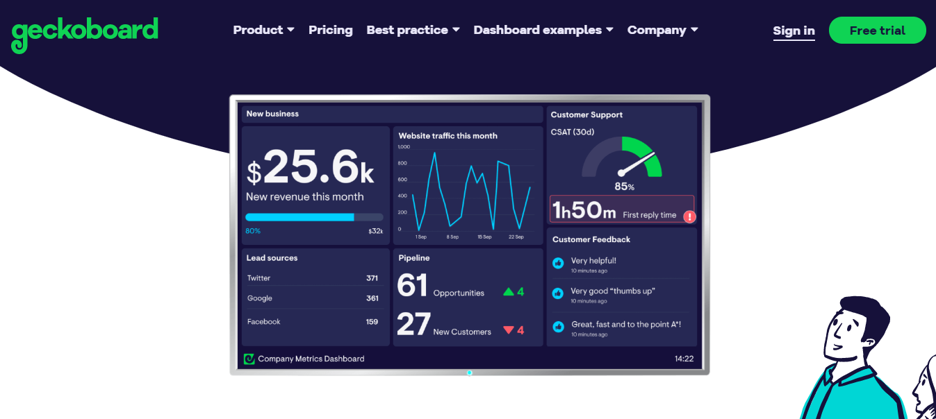
Geckoboard has a nice look and feel to it. It’s easy to use and the metrics are easy to read and visually appealing. The lowest tier is reasonably priced at $39 per month. It is pretty limited though. It allows 2 dashboards and 1 user. And you can send your dashboard to 1 TV. But, if you need to send it to multiple TVs or access it on mobile you have to subscribe to a higher tier, which jumps up in price substantially.
Here is the analysis breakdown for Geckoboard:
Price: Starts at $39 per month. Also, there is a 30 day free trial.
Integrations: Able to integrate with over 60 platforms. A few of the available integrations include Google Analytics, MailChimp, Stripe, YouTube, Facebook and Twitter. Can also integrate with Google Sheets and Excel.
Data Freshness: Data is available in real-time.
Device Capability: Can send to 1 TV with the $39 plan. To access on unlimited TVs and use mobile dashboards you need to upgrade to the next tier which is $159/month.
Export Options / Report Scheduling: It doesn’t appear to have options to export or schedule reports.
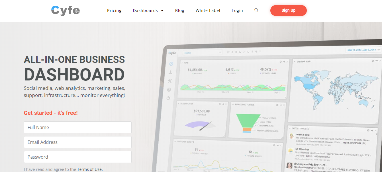
Cyfe is a good looking tool with a great set of features. And they even have a free plan. The free plan does limit you to 2 dashboards but they are fully functional and don’t expire. This tool really shines with the solo plan for $29 per month. The paid plan adds several features such as TV mode, unlimited history, and export options.
Here is the analysis breakdown for Cyfe:
Price: There is a free account available.
Integrations: There are many integrations available. A few popular integrations are Google Analytics, MailChimp, Stripe, YouTube, Facebook, and Twitter.
Data Freshness: Data is available in real-time.
Device Capability: TV mode is available on all paid plans, which starts at $29 per month.
Export Options / Report Scheduling: Unlimited history and unlimited data exports are available on all paid accounts. You can download or schedule email reports of your data in PNG, JPEG, PDF, and CSV formats.
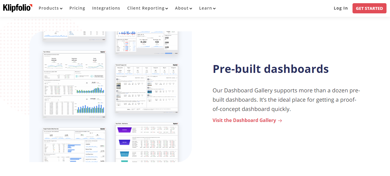
Though this is one of the more expensive tools we looked at, it has some nice features for the more advanced user. This tool will have a steeper learning curve, but you’ll have more options to analyze your data intelligently with some self-service BI features. If you’re still a little scared of data, this probably isn’t the tool for you.
Here is the analysis breakdown for Klipfolio:
Price: Free for 14 days, then starts at $70 per month.
Integrations: Yes, there are hundreds of data integrations available.
Data Freshness: The lowest tier has a 1-hour data refresh period.
Device Capability: There is a TV mode available. An app needs to be downloaded to review dashboards on mobile.
Export Options / Report Scheduling: You can export dashboards as a PDF. You can also schedule an email to send a PDF or image.
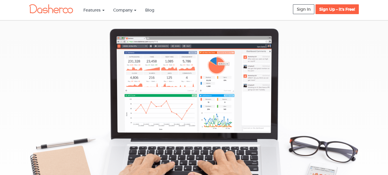
This is another good looking dashboard option. The pricing is very reasonable with a completely free option. The free plan does limit you to 1 dashboard with 8 insights. For a reasonable $19 per month you can upgrade to the grande plan and unlock several useful upgrades. It allows 8 dashboards with 40 insights, export options, sharing capabilities, and a slideshow mode to display the dashboards on a TV.
Here is the analysis breakdown for Dasheroo:
Price: There is a free plan available.
Integrations: They do have a handful of integrations available including Google Analytics, Google Sheets, Stripe, YouTube, Facebook, and Twitter. MailChimp is not an option. One of the integrations available is Zapier, which you can leverage to handle any missing applications.
Data Freshness: Data is updated daily on the free plan. With the $19 per month plan the data is updated hourly.
Device Capability: There is a mobile dashboard available with an app. There is also a slideshow mode available with the $19 per month package.
Export Options / Report Scheduling: You can download a PDF or PNG with the $19 per month package.
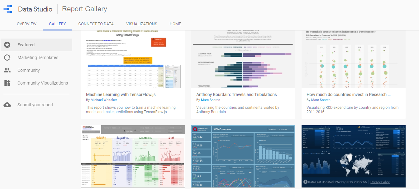
There is a lot you can do with Google Data Studio. It takes a little more time to make it look as polished as some of the other tools but the customization options far surpass any other free options. You not only have several integration options but you also can create calculated metrics within Data Studio to create custom metrics based on existing metrics.
Here is the analysis breakdown for Google Data Studio:
Price: Completely free.
Integrations: Very easy to integrate with Google products such as Google Analytics, Google Sheets, Google Search Console, and YouTube. There are other integrations that have connections created by Data Studio partners.
Data Freshness: Data is refreshed every 15 minutes by default.
Device Capability: There is a full screen mode available.
Export Options / Report Scheduling: You can receive a PDF either by downloading or scheduling an email.
Conclusion
There isn’t a bad option in this list. The best option for you will vary depending on your needs.
Here’s a side-by-side comparison with all of the tools and features we just went over:
Geckoboard
Cyfe
Klipfolio
Dasheroo
Google Data Studio
Price
30 day free trial. Starts at $39/month.
Free account available.
14 day free trial. Starts at $70/month.
Free account available.
Free
Integrations
60+ integrations including Google Analytics, MailChimp, Stripe, YouTube, Facebook, Twitter, Google Sheets, and Excel.
Yes, many! Some integrations include Google Analytics, MailChimp, Stripe, YouTube, Facebook, and Twitter.
Yes, hundreds of integrations available.
They do have some including Google Analytics, Google Sheets, Stripe, YouTube, Facebook, and Twitter. They don’t support MailChimp. They do integrate with Zapier which you can leverage to connect any missing integrations.
Very easy to integrate with Google products such as Google Analytics, Google Sheets, Google Search Console, and YouTube. Other integrations have connections created by Data Studio partners.
Data Freshness
Real-time data.
Real-time data.
1 hour data refresh on lowest tier.
Daily on free plan, if you go up to $19/month plan it’s hourly.
Every 15 minutes by default.
Device Capability
Send to 1 TV with $39 plan. To access on unlimited TVs and use mobile dashboards need to upgrade to next tier which is $159/month.
TV mode is available on all paid plans, which start at $29/month.
TV mode available. Must download an app to access dashboards on mobile.
Can view mobile dashboard with an app. There is a slideshow mode available with the $19/month package.
Full screen mode available.
Export Options / Report Scheduling
None.
Unlimited history and unlimited data exports on all paid accounts. Download or schedule email reports of your data in PNG, JPEG, PDF, and CSV formats.
Can export as PDF. Can schedule email to send PDF or image.
Can download a PDF or PNG with the $19/month package.
PDF available via download or scheduled email.
My go-to choice is Google Data Studio. It provides a lot of flexibility and can handle everything I need. I enjoy the formatting options and being able to add text and images to my dashboards. It makes it easier to tell a story with my data and remind myself what question the metric is answering.
My favorite paid tool on the list is Cyfe. I have used this in the past and been very happy with it. The dashboards and TV mode look great, the data is updated in real-time, and it can integrate easily with just about anything.
If you aren’t sure, start with some of the free options or free trial and get a dashboard set up. Know what questions you want to answer with data and then play around with a few. As long as you’re focused on the KPIs that move your business forward any of these tools will be great. Understanding what is working and what needs improvement will keep you going in the right direction.
Do you want to listen to this article? Here’s the podcast episode:
It’s important to understand the strengths and weaknesses of any website. And, a great way to do that is by monitoring metrics. We’re going to walk through how to create a metrics dashboard for free!
There are several dashboard tools out there. And if you have the budget, you may want to start with one of those tools. But, don’t let a budget stop you from monitoring the metrics that matter for your website. There are ways to track your website performance even without a budget.
One of the bells and whistles popular dashboarding tools tout is the ability to view your dashboard in a TV mode. Don’t worry, we’ll cover that too. Again, for no cost.
Make Sure You’re Using Google Analytics
First things first, make sure you have Google Analytics set up on your website. If you aren’t tracking your website performance, you won’t have any metrics to monitor.
Make sure you not only have Google Analytics installed, but confirm the metrics you care about are being tracked. That means, look at your goals. Go to Admin and then under View click on Goals.
Add any events for items you’d want to monitor on your dashboard. This can include video plays and resource downloads.
Create Your Dashboard
Option 1: Google Analytics
Creating your dashboard with Google Analytics will be the simplest, but most limited option.
You are limited to 20 dashboards
Each Google Analytics view is limited to 20 private dashboards per user. You can also have 50 shared dashboards per view.
This may be more than enough for some people, but it’s important to know there is a cap. It’s nice to have a few go to dashboards in Google Analytics. But, because of this cap, you’ll want to leverage a different tool to view granular data reports.
Each dashboard can only have 12 widgets
You can adjust the size and column layout of the widgets. But, at the end of the day, no matter how you configure them, you’re limited to 12 widgets per dashboard.
If you are looking to monitor just your primary KPIs (Key Performance Indicators) this will not be a problem. In fact, keeping it simple will be helpful if you’re planning to display the data on a TV later.
However, just like with the dashboard cap, if you want to review granular data reports you’ll need to look into a different dashboard tool.
You have to use the pre-configured dashboard widgets
The Google Analytics dashboard system is simple and easy to use. This is definitely a benefit for beginners.
They have a simple interface that allows you to choose the type of chart and then you insert the Google Analytics dimensions and/or metrics you’d like to include.
You’re able to do quite a bit with the options available. However, if you have a very specific chart in mind, you may not be able to create it in a Google Analytics dashboard.
For example, you can only include up to two metrics in a table. And you can’t display more than 10 rows.
You can’t include data from any source
Not only can you not include data from any outside sources (such as Google Sheets), but you also can’t include data from any other Google Analytics profiles. You are limited to only the data in the profile / view that you are currently in.
You can copy a dashboard and view it in other Google Analytics accounts but that can make it more tedious when it comes time to review.
Option 2: Google Data Studio
Google Data Studio is a great option. It does have a bit of a learning curve, but you can get as simple or advanced as you’d like.
It will function and create beautiful charts even if you don’t understand the majority of the features.
You can add your Google Analytics account as a data source and then create just about any chart you’d like. It’s also easy to format the chart / dashboard to match your brand.
You can leverage calculated metrics
Google Data Studio does include the ability to create calculated metrics. So, you can pull in your Google Analytics data and then make simple calculations to create a new metric.
For example, if you want to show conversion rate as (Transactions / New Users) * 100 instead of (Transactions / Sessions) * 100, you can create that using calculated metrics. You don’t have to add any other data sources, it can manipulate your Google Analytics data.
And, if you create a calculated metric it doesn’t modify the existing metrics. You can create them without worrying about damaging your data.
Option 3: Google Sheets (with or without Data Studio)
The last option is Google Sheets. There are a few different ways to use this as your dashboard tool.
If you want to manipulate your data, and the calculated metric option in Data Studio wasn’t enough, this will give you what you want.
You can add Google Analytics filters and segments to the report and customize it however you’d like. Then, you can schedule the report to run at a regular interval (hourly, daily, weekly).
You can create multiple reports on one spreadsheet. When you run the reports it will create a tab for each of the reports. When you re-run the report (either manually or scheduled) it overwrites the data in the same tab.
Because of this, you can create a new tab to use as a worksheet for any calculations you’d like to make. When you update the report, all of the tabs with Google Analytics data will update, and then any fields you’re using in your worksheet tab will update with the newest data.
Create Full Dashboard in Google Sheets
If you’re happy with using Google Sheets, you can use it to create your entire dashboard.
Just create a new tab with the charts you want to include. You can reference data from the Google Analytics add-on reports and your charts will update when the report is updated.
Display Google Sheets Data with Data Studio
Using Google Data Studio to display the Google Sheets data is my preferred method. It looks beautiful in Data Studio, but you still have all of the flexibility Google Sheets provides. This is how I created my automated post-publish content review dashboard.
When you add Google Sheets as a data source in Data Studio, only add the tabs with fields you want to create charts with. If you enter in all of the analytics data dump and any worksheet tabs you have it will get more complicated if you want to make adjustments in the future to your Data Studio charts.
So, Which Option Should I Choose?
If you want simplicity and the bare minimum, just use the dashboard system built into Google Analytics.
If you want it to look beautiful with only a small learning curve, then use Google Data Studio.
If you want the advanced options and the most wiggle room for future changes, use the Google Analytics add-on for Google Sheets combined with Google Data Studio.
Turn on TV Mode for Your Dashboards
Okay, so now you have your dashboards created and you want to put it on the TV. You’ll need to have a computer hooked up to your TV or use a spare computer and monitor to display in TV mode. Once you have the tech in place, you’re ready to turn your dashboard into TV mode.
If you only have one dashboard, this is pretty simple. Just navigate to your dashboard and make it full screen.
It gets more complicated when you have multiple dashboards that you want to automatically rotate.
To accomplish this, open each dashboard in a new tab in Google Chrome. Then, use the Revolver – Tabs chrome extension. This will allow you to set the duration for each tab and then it will rotate through each.
That’s it! It can be that simple to set up a dashboard to monitor your key metrics, even if you have no budget to allocate to reporting.
Have you configured a dashboard for your website? Let us know in the comments!
To be successful, marketers need to be able to track their campaigns. One of the tools marketers can leverage to make that happen are UTM tags. Let’s discuss how to create a UTM code to track your marketing campaigns.
What are UTM codes?
First, let’s start with what a UTM tag is. A UTM tag (or code) are the text parameters appended to the end of a URL in order to identify specific criteria when a link is clicked.
UTM tags allow marketers to gain more insight into each click. They make it possible to attribute link clicks to particular marketing campaigns.
Why use UTM codes?
Well, in case it wasn’t clear already, UTM tags allow you to track campaign performance. They provide additional visibility into the acquisition sources. They allow marketers to identify which campaigns and variables (including channels and ad copy) were the most successful.
Adding a UTM code to your campaign link will provide data that otherwise would be lost. In almost every case the data you gain from the UTM tag is not available from a different source.
UTM tags are great, but they aren’t always the answer. UTM tags track acquisition sources (external links) whereas events can be added to track internal links. If you aren’t sure if a UTM tag is right for your need here is some information on UTM tags versus event tracking and when to use them.
How do I make a UTM tag?
Let’s get into the nitty gritty and actually create some UTM codes.
Google offers a Campaign URL Builder that makes it simple to add UTM tags to your URL.
If you use Google’s URL builder, you can enter the desired data into fields and then copy and paste the final URL with the UTM code included. This eliminates the need for any technical knowledge. But, you still want to understand what the fields mean to get the most value out of the data.
Website URL (Required)
The first item you’ll enter is the URL you want the UTM code appended to. If you’re sending traffic to your homepage, then enter your homepage. If you want to add UTM tags to a URL that goes to a specific campaign landing page, then enter the campaign landing page into the Website URL field.
Campaign Source (Required)
In the campaign source field you’ll want to enter the referring source. This will usually be the website where the link could be found. So, it might say the URL of the referring domain, or it may be more vague such as mailchimp or google.
Campaign Medium (Required)
This is where you’ll enter the type of marketing campaign. Some examples would be email, cpc, or banner.
Campaign Name (Required)
This is where you’ll enter the name of the specific marketing campaign.
Campaign Term (Optional)
This is an optional field that can be used to enter in keywords. This field is rarely used with organic efforts or paid Google campaigns. It can be useful for 3rd party (Bing, Quora, and Facebook) paid campaigns.
Campaign Content (Optional)
This is another optional field, but can be very useful. This is where I like to add detail. If you’re creating a link for an email campaign use this field to enter the date sent and subject line.
If the campaign you’re tracking will have different variations, use this field to differentiate them. Trying different ads or send dates? Take advantage of this field. That way you can look at the complete campaign data using the campaign name field, but you still can break the data down by variation when needed.
Are UTM Tags Different for GA4?
The method we just went over to create UTM tags is the same whether you want to track in Universal Analytics or GA4. It uses the same exact tag. You’ll be able to see the data in both profiles.
The one difference you need to be aware of is right now GA4 only shows the required data fields. There is no place to view the optional UTM parameters in the GA4 profile right now. GA4 is still being improved so I’m sure this will change in the future. Right now it doesn’t hurt to add the other data if you’d like it tracked in Universal Analytics, and maybe someday it will appear in GA4 as well.
Do not forget to add campaign source, medium, and name to your UTM tag. These fields are required. If you forget one, and go to the URL to test it, the page will still load. The page won’t be broken but the data won’t be collected properly. That means, while the page is still accessible you won’t be able to view the data properly in your analytics account.
Use a URL Shortener
Appending all of the UTM parameters to your campaign URL can create a cumbersome and messy looking URL. You don’t want to burden people by asking them to type the entire URL in.
Most of the time you can hyperlink text (create a link) so the actual URL length is irrelevant to the user. But, if you want to track a URL in a printed marketing material or on a social network, you can’t always hide the link URL.
To make your URL with UTM code easier for people to use, shorten it. You can use bitly or ow.ly to shorten the URL to a more manageable length.
UTM Tags are Case Sensitive
It’s important to know that UTM codes are case sensitive. Campaign sources and mediums should be entered in the same way every time. If a medium of email is entered once, and then Email the next time, it will be difficult to analyze the data. Instead of combining those mediums together, they will appear as two separate rows on your data.
For each case variation, added space, and type-o, there will be a new row of data. This is why you’ll want to keep a spreadsheet.
Track Naming Conventions in a Spreadsheet
Track your common UTM tags in a spreadsheet to keep your data as clean as possible. Staying consistent with your naming conventions will make it easy to review and analyze data.
Once you start using UTM tags, you’ll re-use sources and mediums often. Add these to a spreadsheet. Instead of typing them in each time, just copy and paste them. This makes it easier to avoid type-os.
Create some guidelines and document them on your spreadsheet to help reduce future errors. I’d recommend always using lowercase and never allowing spaces. You can choose to replace spaces with hyphens (-) or underscores (_).
Establish a clear naming convention for UTM tags and keep it documented in an easy to share spreadsheet. That way, if anyone else is creating a UTM tag for your company, you can share your rules and keep your data clean and easy to review.
Where Do I View Data From My UTM Tags?
Great, you’ve added UTM tags to all of your marketing campaign links, but now what? Where do I find the data?
Your UTM tag data will be available in your Google Analytics account whether you have Universal Analytics or GA4. If you have both profiles set up, you’ll be able to view it in both.
Finding UTM Data in Universal Analytics
To view it in Universal Analytics, go to Acquisition > Campaigns > All Campaigns.
You’ll be able to adjust the primary dimension to view by name, source, or medium. You can also add a secondary dimension with any of those fields or the optional (term or content) fields.
Finding UTM Data in GA4
In GA4 you can find it under Reports > Acquisition > Traffic acquisition.
You can change the first column dropdown to Session Campaign, Session Medium, or Session Source to view the UTM campaign, medium, and source parameters. If you’d like to view source and medium together you can change the first column back to the default grouping and add an additional column with Session Acquisition > Session source / medium.
Which types of marketing campaigns do you add UTM tags to? Let us know in the comments!
Do you want to listen to this article? Here’s the podcast episode:
The Google Analytics Search Console integration allows marketers to get a more complete picture of organic search traffic. Combining the data and metrics from Google Search Console and Google Analytics makes it easier to make informed content decisions.
Let’s walk through exactly how to integrate these two tools.
Step 1: Create a Google Search Console Account
Before you can connect a Search Console account to Google Analytics, you need to add your website to Google Search Console. Review our guide to setup a Google Search Console account if you don’t already have it configured.
You’ll need to add your website as a Search Console property and verify you own the domain. The guide above will walk you through that process.
Step 2: Link Search Console Property in Google Analytics
Click the gear icon to navigate to the Admin panel.
Under Property click on All Products in the Product Linking section.
Scroll down until you see Search Console and click Link Search Console.
Click Add.
Select the Search Console property you want to associate with the Google Analytics property and click Save.
You can only have one website connected with each Google Analytics property. If you need to, you can change the Google Search Console property. To change it, follow the steps above. But, when you get to step 3, you will click Adjust Link. The rest of the process is the same.
What Search Console Data Gets Pulled to Google Analytics?
When you integrate Search Console with Analytics you’ll be able to see search query, landing page, country, and device as dimensions. You’ll be able to see average position, impressions, and clicks as metrics.
And the best part, you’ll be able to see the standard Google Analytics metrics such as bounce rate with the Search Console dimensions.
When can you see the data and for how long?
Google Search Console keeps data for 16 months. This same range will be applied to the Search Console data shown in Google Analytics.
There is a 48 hour delay before Search Console data will display in Google Analytics.
When connected, historical data is pulled through. The data will go back to how old the Google Analytics property is or how old the Search Console verification date is, whichever one is the most recent.
Integrating these tools will allow you to make better use of the data. Combining multiple tools into one place is not only a time-saver but also provides deeper insight.
Have you connected Search Console with Google Analytics? What Search Console report do you find you use most often in Google Analytics?
Google Analytics provides content marketers with the data they need to make informed decisions. But, it can be overwhelming. If you’re new to Google Analytics you may not know where to look. Let’s discuss the reports you need to know about in Google Analytics for content marketing.
Google Analytics can help you determine what type of content converts (and does not convert), ideas for new content, and who your content should target. It will also show how your existing content and content distribution channels are performing.
Determine What Content Converts
Knowing what type of content converts will guide your content strategy. It will show what should be updated and what type of content to create in the future.
Set Up Goals
Before you can gauge what converts, you need to set up your goals. Configure goals so you can measure what matters most for your business.
To configure goals, go to the Admin panel and click Goals under the View section. Then click New Goal and follow the steps to set goals that make sense for your website.
Find Patterns / Themes in Top Content
Take a look at your top landing pages to identify if there are any patterns you can identify and leverage. If the top performing content pieces are all on a similar topic, write more articles on that topic. If they all share a common element such as an infographic, add more infographics to your articles.
To view your top landing pages go to Behavior > Site Content > Landing Pages. In the right-hand section you’ll see the Conversions metrics. Select your primary goal from the dropdown in the Conversions section. Then, click the heading name for the primary metric you want to track. This will sort the data by that metric so you can identify the landing pages that had the biggest impact on the metric you want to improve.
Once you’ve sorted the data by the performance of your primary metric, that is when you’ll want to review the top content to identify any patterns or themes.
What Doesn’t Convert?
Not only can Google Analytics show you what does convert so you can make more of it, but it can also show you what isn’t converting so it can be improved.
You can view this data on the landing pages report but I’d recommend navigating to all pages to get a better overall picture of the under performers.
Go to Behavior > Site Content > All Pages. To add a filter click on Advanced above the metric names. You’ll want to include pageviews and add a second metric to also include bounce rate.
Keep both metrics set to Greater than and input a value that makes sense for your website. The values are going to vary depending on the length of your date range and your website traffic. You can try setting pageviews to greater than 100 and bounce rate greater than 50.
If this returns no results, lower the pageviews to 75 or 50. If this returns too many results, increase the bounce rate to 70, or 80. Play with the values until you have a list of 5-10 problem pages that you can try to improve.
The goal of this is to narrow the list of pages down to a few key issues. You’re looking for pages that receive traffic (so they’re worth your time) but aren’t performing as well as the site average.
Find Content Ideas
Google Analytics is a great tool to review and analyze your existing content. But, there are also a few reports you may be able to take advantage of to generate new content ideas.
Leverage Internal Site Search Data
If you have an internal site search you can track this data in Google Analytics. To enable this feature, go to the Admin panel. Under View, click on View Settings. Scroll down to the Site Search Settings and turn Site search Tracking to On.
You’ll need to enter the query parameter. You can add up to five, just add a comma between each one.
To find the query parameter, run a search on your website and look at the URL on the result page. You should see your search term in the URL somewhere. Right before the term you will see your query parameter. It could look like ?search= or ?q= or ?s=.
You’ll want to add just the query parameter designation and no additional characters. So, if the parameter is ?q=, you’ll just add q to the query parameter field in Google Analytics.
Find Gaps in Your Content
Once you’re tracking your internal site search data, you’ll be able to review the terms people search for on your website.
To view the data go to Behavior > Site Search > Search Terms.
Look at the most popular search terms. Does your website already provide relevant content to address these topics? If not, add this to your content idea list.
These are topics your readers are looking for and they already see you as the expert that will guide them through the answer. Now you need to make sure you’re providing content with the answer.
Fine-Tune Existing Content Based on Demand
When you’re reviewing the search terms report from your internal site search, you may also notice there are terms or concepts that you have content for already.
Make sure that the language you use matches the terms your readers are looking for. If you notice in the search terms report that people search for conversion optimization but you normally refer to it as conversion rate optimization or CRO, consider updating your language to mirror what users are searching for.
You may also uncover a sub-topic or question that doesn’t require an entire article but may be a section worth adding to an existing article.
Review Search Queries
Keyword data has been gone from Google Analytics for years. But, if you connect your Google Search Console account to Google Analytics you can review search queries directly through Google Analytics.
To connect your Search Console account go to the Admin panel in Google Analytics. Under the property settings, click on All Products under the Product Linking section. Then follow the prompts to link your accounts.
Once you’ve connected your accounts, Google Analytics will begin collecting Search Console data.
To review your search query data go to Acquisition > Search Console > Queries. Use this data similar to how you leveraged the internal site search data. Are there any gaps that you can create new content to answer? Are there terms or language being used that differs from what you use on your website? Are there any sections that can be added to existing articles?
Know Who You’re Talking To
Google Analytics can not only help you understand what you should be saying, but also who you are talking to. You need to understand who your audience is so you can fine-tune your content to meet their needs.
It’s important to keep your reader in mind so each article talks directly to a person. If you generalize your content than you are speaking to no one, and your content will resonate with no one. It’s better to speak to one person than everyone. But, who is that one person?
Under the Audience section you can view demographics and interests. Navigate to Audience > Interests > Affinity Categories to get an idea of the interests and habits of your site visitors.
This data will not only give you a better idea of who you’re talking to, but it can also provide content tie-in ideas. If your audience likes sports you can add some sports analogies. You can create an article related to a popular TV show or movie for entertainment lovers. These categories can add a fun twist to traditional content ideas.
Understand How Your Content Performed
Of course one of the best, and most common, uses of Google Analytics for content marketers is to review the performance of your articles.
Add Annotations To Visualize Impact of New Content
Google Analytics allows you to add notes that appear as icons on the timeline graphs. This makes it easy to get a rough idea if there was a manual action taken immediately before a spike in traffic.
Documenting big site changes can make it easier to understand the full story when looking at your data. Some items you may want to annotate include site outages, new site designs, and product launches. If content marketing is a key strategy for your business, documenting article published dates could help you understand the data later.
When you release a new article click on the down arrow below any graph. Then click create new annotation. There you can add your note. Enter the date you want the note recorded on and a description such as Published Google Analytics for Content Marketing Article.
Having an article published directly before a spike in traffic doesn’t necessarily mean that article was responsible for the increase. You’ll have to dig in to the All Pages report under Behavior to get a better idea of the traffic for a specific page. But, when you see a big spike it’s nice to get an idea about what happened on the site right before so you can get an idea of where to look. It helps paint the picture of some of the factors that could have contributed.
Review Source / Medium to Analyze Distribution Channels
Once you’re reviewing the content article you want to analyze, add in a secondary dimension to get an idea which distribution channels have the biggest impact.
Let’s take a step back. Looking for where to review your content article? Start with the All Pages report under Behavior. You can use the search field above the metric names to narrow the data down to the article(s) you want to analyze.
Now that you have your article data in front of you, add a secondary dimension. To do this, click the Secondary dimension dropdown at the top of the data table. Add the secondary dimension called Source / Medium. (You can use the search field in the dropdown to quickly find the dimension.)
Now, you can view the articles broken down by channel. So, you can compare metrics for google organic traffic to the page versus facebook traffic or paid ads.
Advanced Tip: Create Automated Dashboard to Track Performance Over Time
Monitoring your results on an ongoing basis will make it easier to identify trends. You’ll be able to recognize popular articles and let that guide your future content themes.
You can leverage Google Data Studio to create dashboards. That way you can monitor the metrics that are important for your business.
Google Analytics allows you to make data-driven decisions. Here are the reports you can leverage in Google Analytics to improve your SEO efforts.
Know What’s Working So You Can Double Down
Report: Acquisition > All Traffic > Source/Medium
Google Analytics can make it easy to see which channels are performing best. The channels could be various social networks, organic search traffic, or paid ads.
It will be easier to grow channels that are already performing well than it will be to try and grow traffic on a channel with sub-optimal performance.
You want to focus on the acquisition channel where your audience is. The current performance of the various channels is a good indicator of where your target demographic likes to spend their time online.
So, before you go all in with organic SEO, make sure that channel is a top performer.
To view the channels that are working best for your website navigate to Acquisition > All Traffic > Source/Medium. This report lists out the various channels people use to find your website.
View the report not only by the top number of users and sessions, but also by the most conversions. You want to not only receive traffic, but make sure those users are high-quality and likely to convert.
Track Demographics to Know Who You’re Talking To
Report: Audience > Demographics > Overview
As we just touched on, you not only want traffic but you want to make sure that traffic is the right demographic. If the visitor isn’t qualified, they will never convert.
In Google Analytics, you can view demographic data. Go to Audience > Demographics > Overview to view the age and gender of your website visitors.
Add a Segment to Determine Who Converts
We want to see not only who visits your website, but who converts. While viewing the demographic overview report add a segment to view only data for people who convert.
At the top you can click Choose segment from list to view the data for a particular segment. Click System > Converters to view a segment of people who have completed a goal or made a transaction.
Determine if Your SEO Efforts are Attracting Qualified Visitors
Add a date comparison and leverage the Assisted Conversions report to determine if your SEO efforts are improving or declining.
View data for the last 30 days and then add a comparison range of the previous period.
View your organic traffic growth under the acquisition report and then navigate to Conversions > Multi-Channel Funnels > Assisted Conversions and click on Organic Search.
Look at the Assisted Conversions and Last Click or Direct Conversions. If these numbers are growing more than your search traffic growth than you are attracting qualified visitors. If they are declining than you want to revisit your SEO tactic to refocus your efforts where you can attract your target demographic.
In Summary
With any marketing effort you want to make sure you can track your results to ensure you’re having an impact. SEO is no different.
Figure out your goals, and then decide how you can measure them in Google Analytics.
Keep an eye on these reports to make sure you’re headed in the right direction and be ready to shift your efforts to align with your goals and audience.
What is your favorite SEO report in Google Analytics? Let us know in the comments!
Multitasking lowers productivity by 40%! Batch tasks for efficiency, especially in blogging. Boost productivity with our step-by-step guide to batch your blog content creation.Read More