As ClearPath was stepping closer and closer to a product we were eager to share with the public, we knew we needed to start gathering beta testers. We knew we’d need a group of users willing to test our product and provide us feedback in exchange for free access. If you do a quick Google search, or ask around, you quickly learn that being featured on BetaList.com is the best way to accomplish that. With that knowledge, our BetaList journey began and we were determined to get ClearPath featured.
The First Step to Being Featured on BetaList
We read through all of the BetaList FAQs and selection criteria. We were confident that ClearPath met every requirement and with much anticipation we submitted our startup.
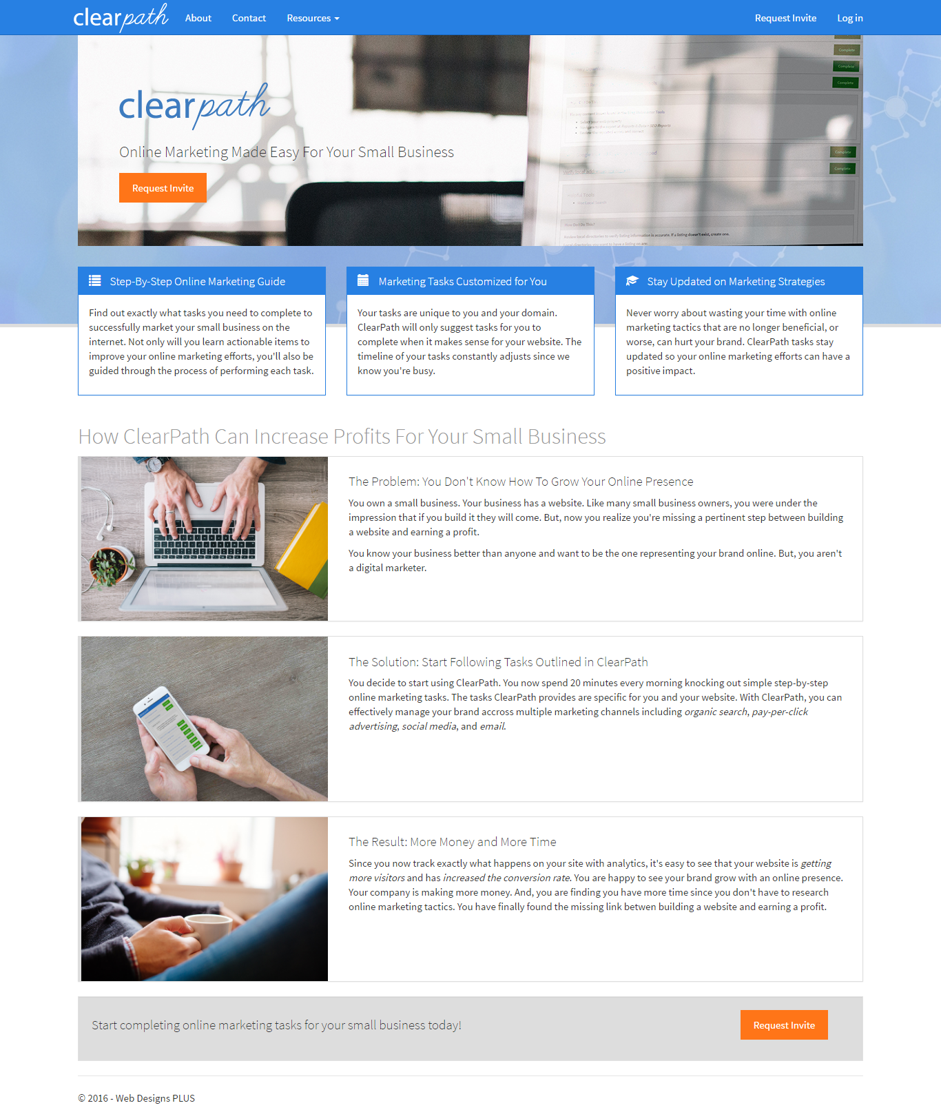
When we submitted ClearPath initially, this was what the homepage looked like:

Once we pressed submit, we just sat back and waited for our acceptance email.
Unfortunately, we received our notice but it was of rejection. However, they were nice enough to include a reason. The reason they provided was:
Our audience places a high value on clean, refined and user-friendly designs. Based on our experience having featured thousands of startups we feel your homepage design would provide disappointing results. Design is a tricky topic and we wish we could point to specific parts to change, but it’s more the overall look and feel which is very difficult to say anything productive about over email.
I, of course, was disappointed. Yet, I really appreciated this feedback and opportunity for improvement. Our design was custom, and fairly clean, but there were certainly areas that could be improved. The site was text heavy, and contained mainly stock images.
Learning from Reject #1
I decided to review the look and feel of every site featured on BetaList at that time. What I found was that most of the sites did look very modern. Most of the designs were full-width and had nice parallax scrolling effects. I saw a lot of videos and product screen shots. I also noticed on the actual BetaList listings, most of the startups had multiple images featured and the images weren’t just homepage screenshots.
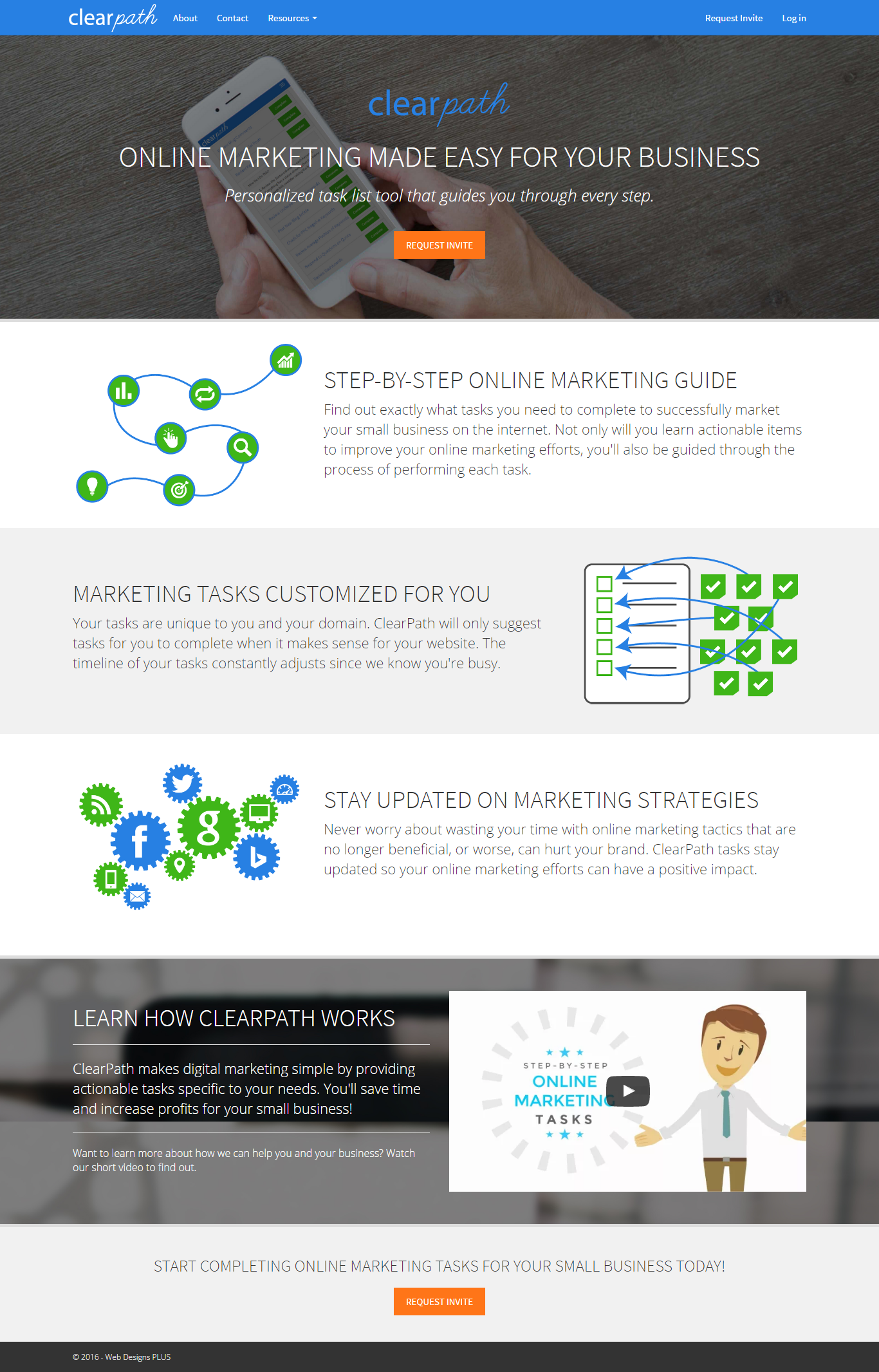
We applied as much of this feedback as we could to ClearPath. We changed the design to be full-width. We created custom images and broke the text out so it wasn’t as concentrated in one section. We improved the header by adding an image of our product in the background and bringing more attention to the call-to-action. We even created an explainer video for users who don’t want to read.
At this point, this is what the ClearPath homepage looked like:

We decided, once again, that ClearPath met every criteria and we were ready to re-submit. This time, we decided to include some featured images with our listing submission. We added the homepage to a desktop and mobile phone, we added screen shots of the product, we altered a stock photo of a hand holding a phone to include a ClearPath screen shot. We also decided to pay to expedite the process. BetaList makes it clear that paying doesn’t improve your chances of being selected, but we figured it couldn’t hurt. We mainly decided to pay because we liked the idea of being featured during a weekday.
Once again, we waited for approval. And, once again, we received a rejection notice. This notice also included a reason, but the reason was identical to the one we received in the first email.
At this point, we started to become a little frustrated. I was under the impression that BetaList only allowed you to re-submit once. However, the email said I could re-submit again and when I logged into my BetaList dashboard the re-submit button was certainly still there. So, I decided this time I’ll do my research and get this approved once and for all.
Another Rejection – Another Opportunity on the BetaList Journey
I was surprised how little information I found on the BetaList approval process. What I did learn was the BetaList team is very small, only a few people. That made me think that it’s very likely the same person reviewed the site both times. Because of that, we made some optimizations to the caching. We wanted to ensure the next time it was reviewed, the reviewer wouldn’t see a cached version instead of the current version with all of our changes.
We decided to start asking around. We asked people what they thought of the design and the homepage overall. In general, we got positive responses, which felt good but wasn’t all that helpful. The most helpful criticism we heard was the message wasn’t very compelling. We decided to focus on the messaging this time and highlight exactly how ClearPath will help you.
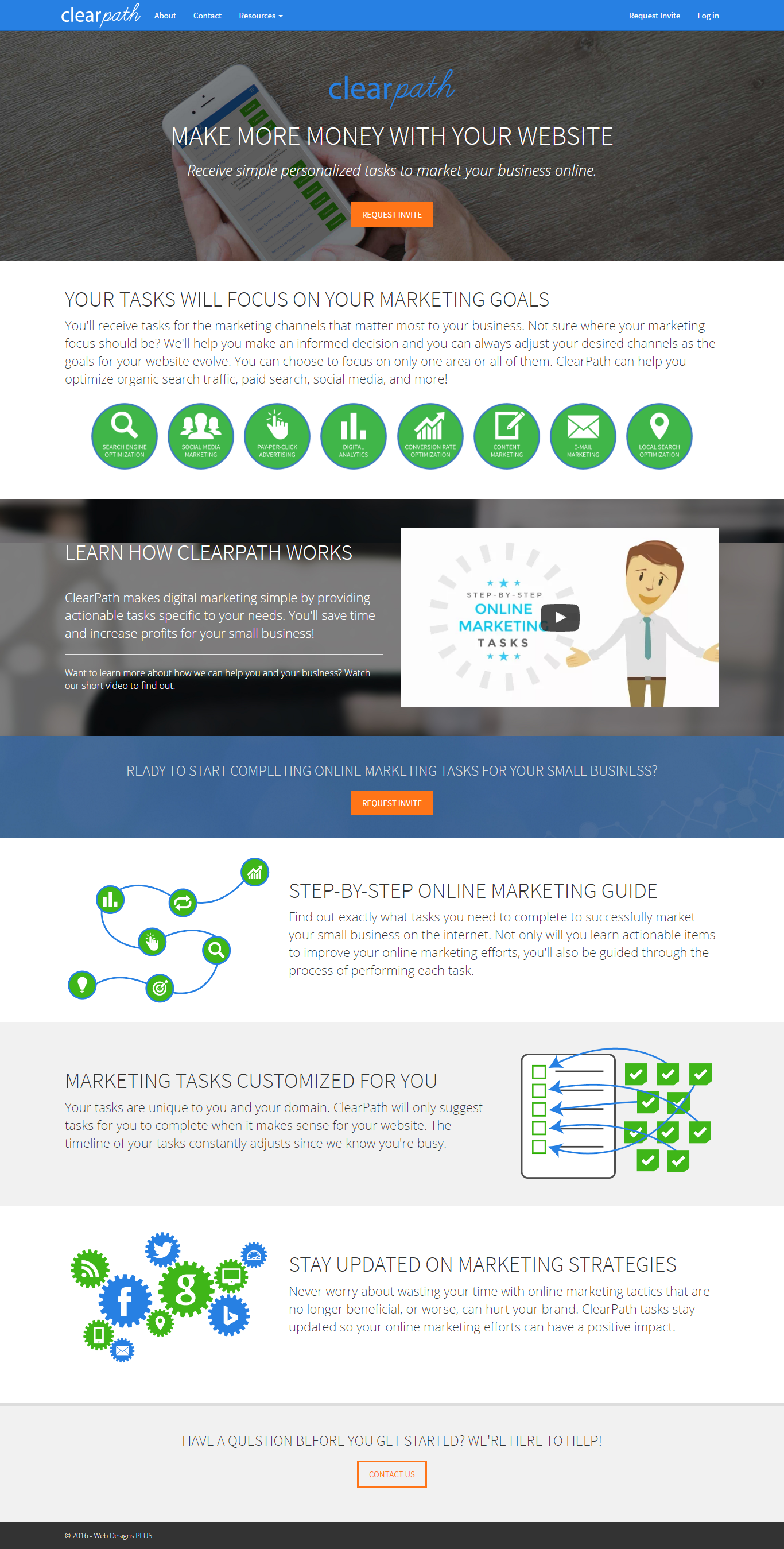
We re-arranged items, added some custom icons, and added content in an attempt to explain the ClearPath value proposition. This time, when we re-submitted we took advantage of a little box that provides the opportunity to communicate with the BetaList team. The box says that you can leave a joke or a comment and the information will not be visible to the public. I took this opportunity to thank the BetaList team. I let them know that I, of course, would like ClearPath to be accepted, but even if it isn’t, the process has already provided us so much value. I wasn’t just sucking up, I was being honest. Our homepage was looking much better and I was really happy with the progress we had made.
Here is what the ClearPath homepage looked like at this stage:

We got rejected again, for the third time. But, this time the reason they included was more helpful. The reason they provided for the rejection this time said:
Your landing page is based on a template or does not have a distinct enough design. For a landing page to do well on BetaList it needs to either have real product images or have a distinct design that sets it apart from other startups.
One Final Attempt to Get Past Rejection
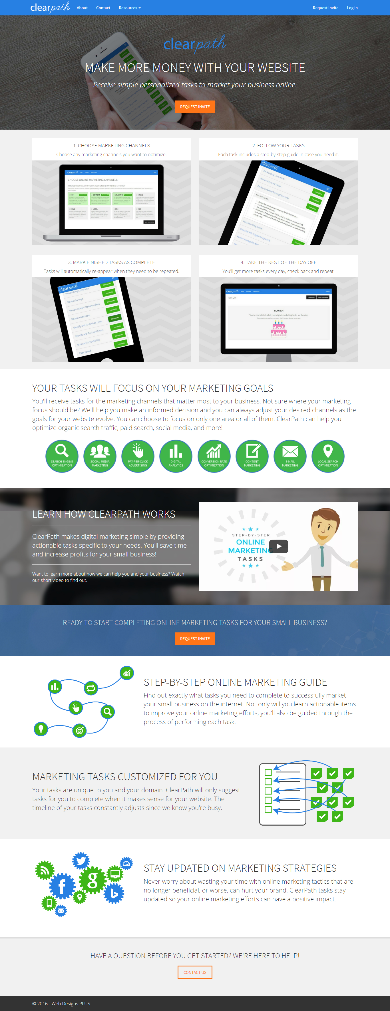
Our landing page was not based on a template, but the message was simple. We needed to add product images. We did have a product image in the background of the header, but clearly that wasn’t obvious enough. So we made one more change to our homepage and added a step-by-step guide on how it works with screen shots of every step. We put this right at the top, below the header, so it was still above-the-fold.
This is what those changes looked like:

We updated our featured images. And this time we decided to add a joke to the private message box. The joke we added was:
Why was the SEO expert so furious on his way to work? Too much traffic!
In addition to the joke, we thanked them once again and asked that they please let us know if they have any feedback.
The Result from Our BetaList Journey
To our surprise, only days after re-submitting, we were featured on BetaList! We were listed at the top of the email blast, and they tweeted about ClearPath. The tweet received 173 retweets and 26 likes. So far, we have received 42 beta requests and more come in every day.
And the best part, the beta requests we have received seem to be from users who are interested and likely to engage. We took the advice from BetaList after we were featured, and sent out a welcome email to thank those users for their interest. So far, our welcome email has a 54% open rate. The email also included a link to follow us on twitter, 7.3% of the respondents took that action and now follow our twitter account.
We were very happy with our BetaList journey. We have already learned a lot just from the process. We are excited to share ClearPath with these beta testers and eager to learn from the feedback they provide us.
Do you have a BetaList journey you’d like to share? Please add it in the comments.
