
Looking for a way to have a large impact on your website conversions? You should be looking into conversion rate optimization. This tactic is becoming one of the most popular strategies to move the needle in your business.
When you think of conversion rate optimization, you probably think of a/b split testing, multivariate testing, and user testing. Don’t get me wrong, those are some excellent tactics and some of my favorite conversion optimization tools. However, depending on your budget and your website traffic, sometimes those tools aren’t a good match for your business.
So what do you do if you want to apply some conversion optimization strategies to your website but you’re a startup with low traffic and zero budget? You stick to the basics, start with best practices. Honestly, even if you have the budget, best practices are still a great place to begin.
Here are some of the tried and true conversion optimization strategies you can apply to your landing pages.
1. Reduce Form Fields
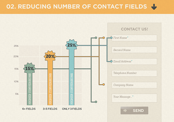
This is one of the most basic rules of conversion optimization, reduce form fields to increase your conversion rate.
Getting data is great, but is it worth missing out on conversions? Remove anything that isn’t 100% necessary. This is sometimes a struggle. Instead of looking at each field and asking if it’s required, start with just one field. Can we limit this to only email address? Think about how you can make it happen. The answer might be absolutely not, we have to have a minimum of email, name, and company. Okay, great! We just got rid of business type, phone number, and location.
Try to keep your forms with between 1-3 fields. This won’t always be possible, but just keep it in mind as you’re creating forms and trying to improve your conversion rate.
2. Use Contrasting Button Colors
Everyone wants to know what the best color is for a call-to-action button. Is it orange, is it green? The answer is: it depends. Don’t get me wrong, color is important. But, when it comes to a call-to-action button, contrast is more important than the actual color.
The key is to make sure the button stands out and is a contrasting color to the background and the rest of the site. As long as the call-to-action button is noticeable, the color isn’t as important. The one color you should stay away from is grey. Grey buttons look like they’re inactive and aren’t as likely to be clicked.
3. Your CTA should describe the action
Write the text on your call-to-action button so it finishes the sentence “I want to…” Clearly describe what will happen when the user clicks that button. Not only does this help manage the user’s expectations, it also helps increase the conversion rate.
4. Keep a CTA Button Above the Fold
Even today, people still don’t scroll down. Make it easy for users to see your primary call-to-action as soon as the page loads. Keep that in mind for both desktop and mobile. If the page is long, repeat the call-to-action at the bottom or in the middle, or both if it’s long enough to be useful.
5. Use Unique Relevant Images – Not Stock Photos
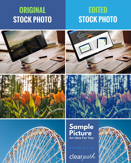
Having images is important. But, more specifically, having unique custom images is important. Stock images seem like a great idea, they save you time and money, but they don’t add value. Stock images are seen over and over again. The same images are not only used on numerous websites, but also on billboards, ads on buses, and magazine ads. Whether users consciously recognize them or not, their brains have already seen the images and they are subliminally ignoring them.
Take the time to get a custom image. If you can take a photo yourself, do it. If you can take screen shots of your product to create images, do that. Do what you need to get some high-quality custom images. It will go a long way with establishing trust with your users and increasing conversion rates.
If you use a stock photo, try to edit the image to include your branding. This can be done a few different ways. You can overlay an image of your product on a device or computer. You can adjust the overall image color or saturation to match the tone of your brand. You can crop the photo in a particular way and embed it in a template for your brand.
Editing photos doesn’t need to be difficult and you don’t need to be a Photoshop expert. All of these examples below were done using an online tool called Canva. Canva has a ton of pre-built templates and elements that make it simple for anyone to design a graphic.
6. Include a Sense of Urgency
Finding a way to include a sense of urgency helps increase conversion rate. There are several ways you can go about doing this. You can include a limited time offer with a countdown. You can show inventory numbers and display only X left. You can display how many other people are watching this same item.
Carry the idea of the sense of urgency into your call-to-action buttons as well. Use words like “Now” and “Today” to stress the urgency.
7. Include Social Proof
People like what their friends like. People like knowing that this product has helped someone just like them. Add testimonials that your key demographic can easily identify with. Make it clear that this is a product for people like them.
Another way to add social proof is sharing your social media metrics. Show how many followers you have. You can also show user metrics specific to your product to help show that your product has helped many people just like them.
8. Add Trust Symbols
If your company has any affiliation with known brands, make sure you advertise that on your site. Were you mentioned in any popular publications? Have big brands used your product? Do you integrate with recognized brands?
Share those logos that people will recognize. They might have not heard of your brand, but if you can add a brand to your site that they have heard of, they’ll trust you more.
Be careful, logos can steal a lot of attention. They’re important to have, but you don’t want them to steal the focus from your call-to-action. Consider de-saturating them so they are gray-scale. That way, people can see them and identify the brands, but they don’t capture too much attention.
9. Make it Easy for Users to Contact You
Clearly list your contact information on your website. Don’t make users have to search around for a way to contact you. Even users who aren’t actively looking to contact you are comforted when they notice how easy it is to get in touch when needed.
How you add your contact information is up to you. You can add your phone number in the header or you can add your full address and phone number in the footer. You can have a live online chat option that floats in the bottom corner of the screen. I’d recommend a minimum of including a “contact” link in your main navigation. On the contact page you can include any contact details you’d like your users to have as well as a webform to make it easy for users to send you a message.
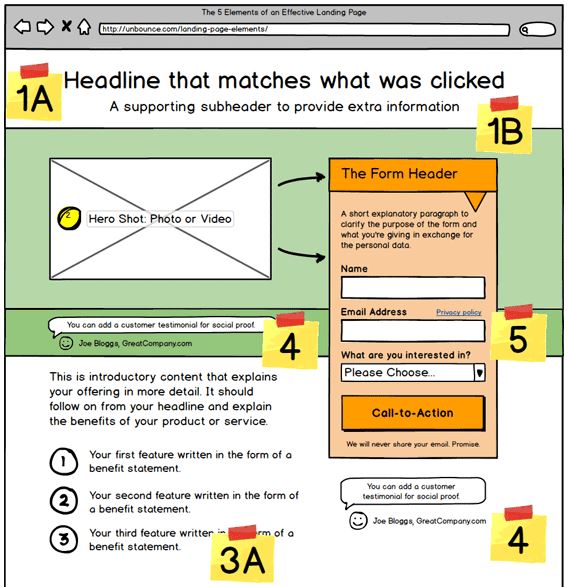
10. Include Persuasive Copy – A USP and Benefit Statements
Make sure to include copy above the fold that clearly describes the benefit of your product to the user. Why should they choose you? Include your unique selling proposition (USP) at the top with your headline text. Remember to not only list features (what the product can do) but also include the benefits (what the product accomplishes).
Unbounce.com offers a great guide that describes not only how to include these items, but where on the landing page they should be placed.
11. Include Emotion
Keep People Happy
Try to incorporate elements in your landing page design that stimulate an emotional response. One of the emotions you can aim for is happiness. Try adding cute animals to your design. Or, include images of happy smiling people. If those items don’t work with your brand or the particular page, try adding bright colors.
Show Pain Points
Another emotion you can try to capture is pain and frustration. Remind users about the irritation they want to avoid. Once you’ve done that, tie it in by making it clear how you’ve solved their problem.
Conclusion
Hopefully these best practices give you a nice place to start with your conversion optimization. Once you build up your traffic and your budget start testing some of these assumptions. Best practices are a great place to start, but remember, your audience could have a different preference.
Do you have any conversion optimization tips to add to this list? Any interesting insights from split tests you’ve performed on these items? Let us know in the comments.