Split tests are fun. They allow you to test your assumptions and make changes that you can be sure make sense for your audience. A split test is when you have two variations of a page on your site (or the entire site) running at the same time. You send half of your traffic to one version, then the other half to the other version. A split test tool tracks results and shows which variation produced more conversions. But, how much traffic do you need to run a split test? We’ll go over the details you need so you know when you’re ready to get started with split testing.
Any amount of traffic is technically enough. Split test tools don’t have limitations. The problem is, with few visitors it can take too long to get a statistical significance. For the results to be statistically significant, you want the results to be at least 90% confident. (And 95% would be even better.) What a confidence level of 90% means, is the declared winner will be the winner 90% of the time.
You also want the test to last no longer than 4-6 weeks. After that time people start to delete cookies and results begin to deteriorate. So, there is a certain amount of traffic required to have a large enough sample size to hit a statistical significance on time.
At a minimum, you want to have 500 conversions per month before you start running split tests. Some people say 500 conversions per week, or 5000 visitors per week. But, if you have 500 conversions per month you should have enough data to get started.
The more variations you test simultaneously, the more traffic you’ll need. So, if you have 500 conversions per month, that’s roughly 250 for each variation. If you want to run more than the original and one variation, you’ll need more conversions.
How to Run Split Tests with Less Traffic
Test Micro Conversions Instead of Macro
If your primary conversion point (macro conversion) doesn’t have enough conversions to run a split test, try a smaller (micro) conversion. So, instead of split testing your payment funnel, try split testing your lead magnet. Having people sign up for your newsletter may not be your end goal. But, if it’s getting more conversions that may be a good goal to try and improve with a split test. Improving that stage could have a trickle down effect and increase conversions lower in the funnel as well. So, you can get closer to the conversions needed to split test your primary conversion point.
Test Radical Changes
If you have low traffic and few conversions, don’t split test small changes. Skip testing button colors, button text, and headlines. Instead, make drastic changes. Completely redesign the page. It will be harder to pinpoint the exact change that improved or decreased conversions. But, since the performance change will be drastic, a conclusive result will be easier to reach.
Combine with Qualitative Data
If you have low conversions, you can combine the split test results with data from other conversion optimization tools. Surveys and qualitative data could provide insight into why the split test results look the way they do. Analyzing heatmaps of the variations could also provide insight to help solidify the results.
In Summary
Without conversions, split tests will be useless because you won’t have data to determine a winner. Once you have about 500 conversions a month, start running split tests. And while you’re getting there, it doesn’t hurt to start listing and prioritizing split test ideas.
Do you want to listen to this article? Here’s the podcast episode:
Conversion Rate Optimization (or CRO) is the act of incrementally improving your website in an attempt to increase the number of visitors that complete a desired action. One method of improving conversion rate is to send surveys to your site visitors. Then, leverage the data from survey responses to make website improvements. But how do you send surveys to site visitors and what survey questions improve CRO?
Why Ask Open Ended Questions?
Open ended questions are going to provide you with the most value. Open ended questions are when the respondent types in a response, instead of clicking pre-configured options. The reason why these provide more value is because you learn how your audience speaks. They may use terms to describe benefits in a different manner than you ever have. Update your content to reflect the same language your audience uses. Write the benefits on your homepage using the same words your visitors use to describe them.
The downside is that open ended questions are more work to analyze. To get the most value, you’ll want to read each response. Of course, looking at a graph is much faster. If at all possible, you should read each response. If that isn’t feasible, you can try to find common themes by loading the results into a word art tool. That will display the results in a word cloud. In the word cloud, the topics that come up the most will be larger so it’s easy to find trends.
Qualitative vs Quantitative
In general, surveys are qualitative data because they are subjective responses. Yet, depending on how you create the question it can be more qualitative or quantitative. Qualitative data is an observed or reported experience. Whereas quantitative data is a measurable metric.
Survey Questions to Ask
Qualitative Survey Questions
Why did you decide to make a purchase?
This can help you understand what led to the buying decision. Was there an initial problem that triggered the purchase? Did something on the website convince the person to complete the transaction? This can help you understand if purchases are due to use cases you’re already aware of, or new ones. If it’s a new use case there may be optimizations to increase the chances of that use case converting others.
If you didn’t purchase, what stopped you?
This question can help you better understand obstacles and frustrations your visitors face. Once you understand what’s stopping people from buying, you can begin improving those areas.
Were you able to complete your task? And if not, why not?
Not everyone comes to your site with a goal to purchase. They may be researching a particular question, or looking for a video or a download. Understanding what people are looking for and if they were able to find it can help you optimize your site navigation.
Quantitative Survey Question
By far, my favorite quantitative question to add to a survey is the Net Promoter Score (or NPS). To get the NPS you ask How likely are you to recommend us to a friend or a colleague? The answer is a number scale of 0-10. Ten is the highest and most likely. Zero is the lowest and extremely unlikely.
If someone answers the Net Promoter Score with a nine or a ten, that means they are a promoter. They had a good experience and they will positively promote your brand. If someone answers with a seven or eight they are passive. The experience was fine, there were no issues, but they aren’t going to go out and talk about your brand. And anyone who answers six or lower is a detractor for your brand. These people will be negative word of mouth for your brand. People are more likely to talk about bad experiences than good experiences.
Ideally you want your NPS in the nine or ten range. If the NPS is six or below you want to talk to your audience and see what you can do to improve the experience.
Survey Tools
There are a few different tools you can use to collect survey responses. You can use Google Forms or Survey Monkey to create stand-alone forms to send to people. This will work best if you already have an email list you can use to contact your audience.
You can also gather survey responses directly on your website through Hotjar and Qualaroo. This is the route I take because it’s nice to get feedback from website visitors. Sometimes people who sign up for your email list do not reflect the same people who visit your site. You want to hear from the people who don’t stay and don’t convert as well as the people who do.
Do you want to listen to this article? Here’s the podcast episode:
One of the best ways to improve your website conversion rate is to observe your site visitors. And one of the easiest ways to do this is with website session recordings. Now, reviewing session recordings can get time consuming. To save time, here’s what to look for and what you can learn from session recordings to make an impact.
What are Website Session Recordings?
Before we get too far ahead of ourselves here, let’s back up and go over what website session recordings are. Session recordings are videos of anonymous visitors using your website. You can’t hear them. You can’t identify who they are. You are only looking at a video of your site and watching a mouse move around it. You see mouse movement, scrolling, clicks, and any pages they viewed. There are a handful of conversion rate optimization tools that you can use to collect this data.
What Can You Learn from Session Recordings?
There are four primary insights you can gain from reviewing website session recordings. They allow you to observe how people navigate your site, discover bugs and obstacles, optimize forms, and identify patterns that result in people leaving. Now, let’s discuss each of those in more detail.
Observe How People Navigate Your Site
When you observe people using the site you will notice issues that others overlook. People might navigate the site in a loop and not even realize it.
I’ve seen this happen before. Someone was trying to register. They were on the registration page but continued to scroll down to read more information. At the bottom of the page there were links to other pages but the registration options were still at the top. They clicked a deeper link. They kept clicking links to get them closer to registering. Eventually, they landed back on the registration page where they started. They were then ready to buy and successfully purchased. They didn’t express frustration at any point. But, as someone familiar with the site, you watch and cringe thinking about all the extra clicks.
There was a simple solution, add a call-to-action at the bottom of the page as well. The recording session made it obvious that there was a need for improvement even if no one reported it as an issue. A navigation issue like that would never get reported because a site visitor wouldn’t see it as a problem. They are unaware there is an easier path.
Discover Bugs and Obstacles
Watching session recordings can help you identify any bugs or obstacles. Sometimes you’ll notice a person’s experience doesn’t go how you would expect. They tried to click something and it didn’t work. A button didn’t submit, a video didn’t play, or a link went to the wrong page.
When this happens, it’s best to try and recreate the issue yourself to confirm it is a problem. You don’t want to spend time trying to fix an isolated issue that is specific to one person. As soon as you confirm it’s an issue, fix it.
Optimize Forms
Session recordings can also help to optimize forms. Filter the recordings so you can review all the recordings of people who visited the page with the form you’d like to optimize. Watch as many as you can to try and find patterns. Is there a particular form field that is causing confusion? Does everyone leave when they get to a certain point? If so, find a way to make that field less confusing. It might need a different name or a tooltip to add some clarification.
Identify Patterns that Result in People Leaving
One last insight you can gain from reviewing website recordings, is to identify patterns that result in people leaving your site. Do people take similar paths before they leave? Does it seem like they are scrolling up and down the same page struggling to find an answer to a question? If you see patterns that result in people leaving, try to identify how to improve the experience.
In Summary
Don’t let reviewing session recordings take over your calendar. Understand you will almost always capture more than you have time to review. But, spend time monthly reviewing enough recordings to identify patterns. Then, use those patterns to improve the user experience on your site.
Do you want to listen to this article? Here’s the podcast episode:
Looking at heatmap images from pages on your website is fun. There’s lots of color, it seems scientific, but how does it help? You collected this data, you want to analyze it and make sense of it, but what are you looking at? Once you understand heatmaps, you can get deeper insight into how people use your website. Let’s go over six ways to increase conversion rate by leveraging website heatmaps.
What is a heatmap?
Before we can use heatmaps to increase our conversion rate, we need to understand what a heatmap is. A heatmap is a visual representation of data. On a heatmap, values get displayed as a color. Red displays the hottest, most popular, and highest values. Whereas blue and purple show the coolest, least popular, and lowest values.
There are different types of heatmaps. The most common types show click data, mouse movement, and scroll depth. Each of these heatmaps start with a screenshot of the page that is gathering data. The data is then displayed as colors that are overlaid on the image. That allows you to visualize the data while viewing the page. The data collected varies depending on the type of heatmap.
Click Data Heatmap: This displays anywhere people click on the page. The click data is visible even if the element wasn’t interactive.
Mouse Movement Heatmap: This displays where people move their mouse on the page. This is a good indicator of where site visitors are looking and what elements draw the most attention.
Scroll Depth Heatmap: This displays how far down the page people scroll. This is a good way to determine how far most visitors see on the first page load. It can also help you see if anyone is scrolling down to view content at the bottom of the page.
Website heatmaps help you understand where to place your most important content. The data allows you to make intelligent content and page layout optimizations. Those optimizations will increase your conversion rate. Here are six insights you gain from heatmaps.
Optimize Content Length
Do people scroll to the bottom of your 3,000 word article? Do they scroll on shorter articles? Take a look to see where they stop scrolling. Once you understand how far people scroll, you can aim to keep your articles at or below that limit. That way, any call-to-actions at the bottom of the page will be visible to readers before they leave.
Improve Menu Item Placement
Looking at heatmaps can help you identify what menu options are being clicked. Does the order of popularity match the order they appear? If not, you might want to rearrange the menu so the popular items are easy to find. And is there an item that nobody clicks? Try renaming or relocating that item. If it isn’t important to your audience, and no one clicks it, it might not deserve space on the main menu.
Confirm Call-to-Action Visibility
Is your main call-to-action displayed in an area people see? It should be above the fold. What that means, is you want it displayed in the first window people see when they visit your site. People shouldn’t need to scroll to click your call-to-action button. Looking at a scroll heatmap will give you this data.
Better Determine Split Test Winners
Heatmaps can help you make more sense out of split test data. Looking at a heatmap of each variation will give you a visual indicator of how the versions differ. How did the changes impact the user experience?
Intelligently Redesign a Page
Before you redesign a web page, take a look at the heatmap data. Are there any elements being clicked that aren’t clickable? Maybe in the next version you need to incorporate a way people can click and view more details on that item. What about the mouse movements and scroll maps? Is the attention going to the key areas as you had planned? If not, determine what elements are distractions and plan to remove or rearrange those items.
Optimize Mobile Usability
Look at the difference between mobile and desktop. This will be especially important with the scroll depth heatmap. Take a look at where the fold is on mobile. It’s likely much higher than on the desktop version. Is your call-to-action button still above the fold on mobile? You’ll want to also take a look at what gets clicked on mobile. The priorities may differ from desktop users and that may cause the clicks to differ as well.
In Summary
Don’t only collect heatmap data, analyze it. Looking at it allows you to visualize improvements. Oftentimes, finding improvements in heatmaps is far simpler and faster than in tables.
Do you want to listen to this article? Here’s the podcast episode:
People visiting your website should have a good user experience regardless of the browser or device they are using to access your website. You’ve confirmed everything looks good for you, but how do you make sure everything looks great for everyone who visits? Here’s how to check browser compatibility of a website to ensure everything works as intended for all visitors.
Discover the Browsers and Resolutions People Use
Before you can test browsers to make sure everything is working, you need to know what browsers and screen resolutions to test. This will vary for every website. What you want to do is find out the details for the people who visit your website.
To do this, look at your Google Analytics account. The report varies depending on if you have the newest GA4 configuration or the Universal Analytics configuration.
In Universal Analytics, you can go to Audience > Technology > Browser & OS. This will show you the most popular browsers for your website.
Along the top, you’ll see Primary Dimension. You can view the data with various primary dimensions such as Operating System and Screen Resolution.
With the Browser primary dimension selected, you can even select a secondary dimension of Operating System to view the exact browser/operating system configurations people use to view your website.
With GA4, you can go to User > Tech > Overview. This will provide a few different charts that make it easy to visualize the most popular browsers, operating systems, and screen resolutions.
Once you understand which screen resolutions and browsers are most important to your audience, you can start to test them.
How to Test Screen Resolutions
Let’s start by testing screen resolutions. In my experience, it’s easier to test the different device sizes than it is to test browsers, and I find more inconsistencies with various screen sizes than I do with browsers, so I tend to start there.
There are two different tools I like to use to test screen resolution. You don’t need to use both. Just pick the tool that you like best and go with that.
Testing with Chrome
You can test your site on different device sizes directly in Google Chrome.
First, navigate to your site.
Right-click anywhere on the page and click on Inspect to open the developer tools.
Click on the Toggle Device Toolbar icon in the top left of the developer tools panel.
At the top of the page, you’ll see a dropdown.
Select Responsive to either enter in any resolution or drag the window to resize.
Select any of the devices from the list to use preset resolutions to view the page in the size used by that device.
Testing with Responsinator
You can test your website on different device sizes with a tool called Responsinator.
Enter your URL where it says Enter your site in the top left.
You can then scroll down and view your site on various device sizes.
How to Test Browsers
Testing browsers can be a little more complicated. Depending on how many computers you have available, you likely won’t be able to test everything yourself. Regardless, that is where I like to start.
Start By Testing with the Browsers You Have
If you have a Windows computer, you’ll be able to test Google Chrome, Mozilla Firefox, and Microsoft Edge. If you have a Macintosh computer, you’ll be able to test Google Chrome, Mozilla Firefox, and Safari. So, basically, you need a Windows computer to test Edge and an Apple computer to test Safari.
The other hurdle you could come across when testing yourself is that you won’t be able to test older versions of the browser. Chrome updates automatically, so that should be less of an issue, but testing old Firefox versions can be challenging.
To start, test what you can. Start by making sure the experience is ideal in the browsers you have available. Then, refer back to your Google Analytics data. Is there a browser a large chunk of your audience uses that you haven’t tested? If so, is there any easy way to test it? Do you have a friend that has access to that browser that can check for you? If not, no worries, we’ll go over the solution now.
Testing Browsers with Cross Browser Testing
There are a few different tools available that you can use to test browsers. My favorite one is Cross Browser Testing. With Cross Browser Testing, you can test your site live on any browser and operating system. You can even select different versions and resolutions.
Instead of testing live, you can also get screenshots back. You just enter the URL and select the browser configurations (or choose a pre-populated list such as popular browsers), and then you will see a page with side-by-side screenshots of that page on all of the different browsers you requested.
This makes it super simple to test any browser. The only downside is it isn’t free. There is a free 7-day trial. There is also a month-to-month option. So, even if you don’t use this all the time, it could be worthwhile to pay for the tool after a major site change or just for one month a year to confirm everything looks good.
In Summary
Start by understanding the browsers and resolutions that are important to your audience. Then, create a plan to make sure you can view your site with those settings to confirm the experience is optimal for them.
Do you want to listen to this article? Here’s the podcast episode:
Let’s start by explaining what SEO and CRO are, then we’ll dig into why you need them!
What is SEO?
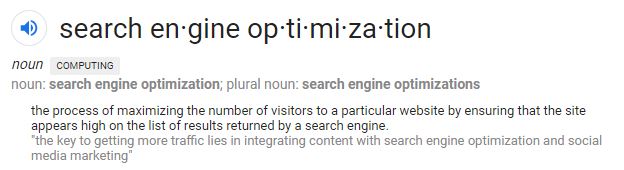
SEO stands for Search Engine Optimization. SEO is the act of making improvements to your website in an attempt to increase your ranking on search engines.
Here is how Google defines SEO:
What is CRO?
CRO stands for Conversion Rate Optimization. It is sometimes referred to as Conversion Optimization. CRO is the act of improving pages and systems on your website to enhance the user experience and increase conversions.
So, now that we understand what SEO and CRO are, why do you need both?
Why SEO and CRO Work Best Together
If your SEO efforts are successful, you’ll get more traffic. And traffic with no conversions is useless.
Likewise, if your CRO efforts are successful your landing pages will be intelligent and beautiful. And a beautiful landing page with no traffic is useless.
SEO is the acquisition method you leverage to get more traffic to your website. Once you have the traffic, you leverage CRO to make sure that traffic converts. These two pieces create the funnel you want users to flow through.
CRO Leads to Long-Term SEO Success
Focusing on Conversion Rate Optimization can benefit SEO because they ultimately have the same goal. CRO can be the key to long term SEO success.
The goal of search engines is to provide the best results for the user. The goal of CRO is to provide the best experience for the user on your website.
Focusing on CRO allows you to align your efforts and goals with those of the search engines. That doesn’t mean you should ignore SEO, but instead be mindful that you aren’t optimizing for SEO at the expense of usability.
CRO and SEO Share Some Success Metrics
There are a few metrics to track that can improve both SEO and CRO.
Page speed has also been one of the many factors used to calculate search engine rankings for years.
Bounce Rate
The other shared metric is Bounce Rate. If a user bounces, that means they saw the website and immediately realized it wasn’t a good fit. You want your target audience to understand how you can relieve their pain or support their needs within 5 seconds. Clarifying the benefit on your landing page helps CRO while reducing bounce rate.
Reducing Bounce Rate can help increase SEO by reducing what is referred to as pogosticking. Pogosticking occurs when a user visits your website from a search engine result, then goes right back to the search and clicks on another listing. This effect creates a higher bounce rate, and can also negatively impact SEO.
A continuous focus on SEO is great. Improving your CRO is fantastic as well. But consciously focusing on both SEO and CRO will allow you to multiply the value you receive from either effort.
Do you prioritize SEO over CRO or vice versa? Let us know in the comments!
Looking for a way to have a large impact on your website conversions? You should be looking into conversion rate optimization. This tactic is becoming one of the most popular strategies to move the needle in your business.
When you think of conversion rate optimization, you probably think of a/b split testing, multivariate testing, and user testing. Don’t get me wrong, those are some excellent tactics and some of my favorite conversion optimization tools. However, depending on your budget and your website traffic, sometimes those tools aren’t a good match for your business.
So what do you do if you want to apply some conversion optimization strategies to your website but you’re a startup with low traffic and zero budget? You stick to the basics, start with best practices. Honestly, even if you have the budget, best practices are still a great place to begin.
Here are some of the tried and true conversion optimization strategies you can apply to your landing pages.
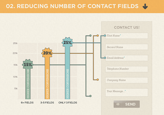
1. Reduce Form Fields
This is one of the most basic rules of conversion optimization, reduce form fields to increase your conversion rate.
Getting data is great, but is it worth missing out on conversions? Remove anything that isn’t 100% necessary. This is sometimes a struggle. Instead of looking at each field and asking if it’s required, start with just one field. Can we limit this to only email address? Think about how you can make it happen. The answer might be absolutely not, we have to have a minimum of email, name, and company. Okay, great! We just got rid of business type, phone number, and location.
Try to keep your forms with between 1-3 fields. This won’t always be possible, but just keep it in mind as you’re creating forms and trying to improve your conversion rate.
Everyone wants to know what the best color is for a call-to-action button. Is it orange, is it green? The answer is: it depends. Don’t get me wrong, color is important. But, when it comes to a call-to-action button, contrast is more important than the actual color.
The key is to make sure the button stands out and is a contrasting color to the background and the rest of the site. As long as the call-to-action button is noticeable, the color isn’t as important. The one color you should stay away from is grey. Grey buttons look like they’re inactive and aren’t as likely to be clicked.
3. Your CTA should describe the action
Write the text on your call-to-action button so it finishes the sentence “I want to…” Clearly describe what will happen when the user clicks that button. Not only does this help manage the user’s expectations, it also helps increase the conversion rate.
4. Keep a CTA Button Above the Fold
Even today, people still don’t scroll down. Make it easy for users to see your primary call-to-action as soon as the page loads. Keep that in mind for both desktop and mobile. If the page is long, repeat the call-to-action at the bottom or in the middle, or both if it’s long enough to be useful.
5. Use Unique Relevant Images – Not Stock Photos
Having images is important. But, more specifically, having unique custom images is important. Stock images seem like a great idea, they save you time and money, but they don’t add value. Stock images are seen over and over again. The same images are not only used on numerous websites, but also on billboards, ads on buses, and magazine ads. Whether users consciously recognize them or not, their brains have already seen the images and they are subliminally ignoring them.
Take the time to get a custom image. If you can take a photo yourself, do it. If you can take screen shots of your product to create images, do that. Do what you need to get some high-quality custom images. It will go a long way with establishing trust with your users and increasing conversion rates.
If you use a stock photo, try to edit the image to include your branding. This can be done a few different ways. You can overlay an image of your product on a device or computer. You can adjust the overall image color or saturation to match the tone of your brand. You can crop the photo in a particular way and embed it in a template for your brand.
Editing photos doesn’t need to be difficult and you don’t need to be a Photoshop expert. All of these examples below were done using an online tool called Canva. Canva has a ton of pre-built templates and elements that make it simple for anyone to design a graphic.
6. Include a Sense of Urgency
Finding a way to include a sense of urgency helps increase conversion rate. There are several ways you can go about doing this. You can include a limited time offer with a countdown. You can show inventory numbers and display only X left. You can display how many other people are watching this same item.
Carry the idea of the sense of urgency into your call-to-action buttons as well. Use words like “Now” and “Today” to stress the urgency.
7. Include Social Proof
People like what their friends like. People like knowing that this product has helped someone just like them. Add testimonials that your key demographic can easily identify with. Make it clear that this is a product for people like them.
Another way to add social proof is sharing your social media metrics. Show how many followers you have. You can also show user metrics specific to your product to help show that your product has helped many people just like them.
8. Add Trust Symbols
If your company has any affiliation with known brands, make sure you advertise that on your site. Were you mentioned in any popular publications? Have big brands used your product? Do you integrate with recognized brands?
Share those logos that people will recognize. They might have not heard of your brand, but if you can add a brand to your site that they have heard of, they’ll trust you more.
Be careful, logos can steal a lot of attention. They’re important to have, but you don’t want them to steal the focus from your call-to-action. Consider de-saturating them so they are gray-scale. That way, people can see them and identify the brands, but they don’t capture too much attention.
9. Make it Easy for Users to Contact You
Clearly list your contact information on your website. Don’t make users have to search around for a way to contact you. Even users who aren’t actively looking to contact you are comforted when they notice how easy it is to get in touch when needed.
How you add your contact information is up to you. You can add your phone number in the header or you can add your full address and phone number in the footer. You can have a live online chat option that floats in the bottom corner of the screen. I’d recommend a minimum of including a “contact” link in your main navigation. On the contact page you can include any contact details you’d like your users to have as well as a webform to make it easy for users to send you a message.
10. Include Persuasive Copy – A USP and Benefit Statements
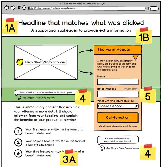
Make sure to include copy above the fold that clearly describes the benefit of your product to the user. Why should they choose you? Include your unique selling proposition (USP) at the top with your headline text. Remember to not only list features (what the product can do) but also include the benefits (what the product accomplishes).
Unbounce.com offers a great guide that describes not only how to include these items, but where on the landing page they should be placed.
Try to incorporate elements in your landing page design that stimulate an emotional response. One of the emotions you can aim for is happiness. Try adding cute animals to your design. Or, include images of happy smiling people. If those items don’t work with your brand or the particular page, try adding bright colors.
Show Pain Points
Another emotion you can try to capture is pain and frustration. Remind users about the irritation they want to avoid. Once you’ve done that, tie it in by making it clear how you’ve solved their problem.
Conclusion
Hopefully these best practices give you a nice place to start with your conversion optimization. Once you build up your traffic and your budget start testing some of these assumptions. Best practices are a great place to start, but remember, your audience could have a different preference.
Do you have any conversion optimization tips to add to this list? Any interesting insights from split tests you’ve performed on these items? Let us know in the comments.
There’s nothing quite like the excitement of running a split test. In fact, the excitement always seems to generate a flurry of great ideas for the next test. How do you organize and prioritize all of these thoughts into actionable test ideas? You create a conversion test scoring system.
What is a Conversion Test Scoring System?
The important thing to know about a conversion test scoring system is that it organizes, clarifies, and prioritizes your split test ideas. The actual system can vary depending on your business. Several industry leaders have documented their systems for scoring conversion test ideas, including Optimizely and Chris Goward. The conversion test scoring system I’m going to outline is a combination of those systems. It’s meant to be easy to use with simple yes/no questions. With this system the hardest part is coming up with the hypothesis, determining the prioritization is quick and simple.
How to Create a Conversion Test Scoring System
Chris Goward’s system uses a simple formula where you put in a value for the potential (P), importance (I), and ease (E) for each idea. The result is a numeric value representing the average of those numbers, PIE. This is a nice system and a great way to think about your test ideas. However, the problem I’ve had with this system is it’s subjective. I’ve found that the PIE metric doesn’t accurately prioritize the test ideas unless I review and adjust the parameters for each test every time. The values seem to vary depending on my mood, data from recent split tests, and changes to business priorities. So, it’s important to review and update all metrics when any new data is added.
Optimizely has created a different system. Their system looks at ten different rules. If a test idea meets a rule, it gets one point, otherwise it’s assigned zero points. The points are added together and the idea with the largest sum is the highest priority.
I liked the idea behind Chris Goward’s system, and the simplicity of a yes/no system introduced by Optimizely, so I made a system that combines these two great tactics.
This combined system looks at a total of nine rules that are assigned one point if an idea meets the requirement, and zero points if it does not. Three of the rules identify the potential, four of the rules determine the importance, and two of the rules measure the ease. We then calculate a PIE metric by taking the sum of the average of the three categories, and dividing by 3.
Category
Rule
1 Point
0 Points
Potential
Fold
Makes a change above the fold
Makes a change below the fold
New Information
Adds new information or a new element or removes an element from the page
Makes a change to the existing elements (copy, color, UI, etc.)
Benchmark
Borrows from a success on one of our prior experiments
No benchmarking best practice
Importance
Main Metric
Supports our main metric (such as payment)
Supports a secondary metric (such as subscribe or share)
Location
Tests a change at the end of the funnel process
Tests a change located on a landing page, or top of the funnel
Targeting
Targets 100% of users
Targets a subset of users
PPC
Could help reduce the CPA for PPC campaigns
Has no impact on PPC
Ease
No Developer
Doesn’t require a developer to implement
Requires a developer
Length
Can be implemented in an hour or less
Would take more than an hour to implement
The rules you follow could vary depending on your product. The important thing to remember is to determine the rules you want to follow to calculate the potential, importance, and ease of your test ideas. Creating concrete rules will allow you to determine the PIE metric without being subjective.
Additional Items to Include with the System
Creating and following the rules to score your test ideas is important. Of course, there is a little more to a conversion test scoring system than just the rules outlined above. Let’s discuss some of the additional fields you should include.
Submitted By
I always like to include a column that documents who submitted the test idea. This helps establish a data-driven culture in your workplace. It’s important to encourage everyone at the office to submit test ideas. If the test is implemented, share the results and findings with the person who submitted the idea. If a test is successful, you can share the results with the entire company and give some credit to the idea submitter.
Hypothesis
The test idea should be written in the form of a hypothesis. The idea should be structured in an If…,then… statement. Creating a hypothesis helps you identify the underlying reason you are performing your test.
Action
Once you have a hypothesis, you can identify the specific action you want to take to test the hypothesis. Structuring it in this manner provides an easy way to progress after a failed experiment. If a test fails, the action you took wasn’t the correct one. But, do you still believe in the hypothesis? If so, determine another action you can make to test the hypothesis.
Page / Location
Document the specific page you will be testing.
KPI
Identify the Key Performance Indicator (KPI). This will be the main metric you track to determine if the test was successful or not. It’s best practice to track multiple KPIs, but you need to understand the primary KPI this test will affect.
Keep in mind, you want to choose a KPI directly related to the test idea. If the idea tests an element on the homepage which is at the very top of the funnel, choosing payment or a KPI that triggers at the end of the funnel is likely not a good choice. Users will encounter many other variables in the middle of the funnel that could skew the data.
How to Calculate PIE
So, now you have documented the person who submitted the idea, created the hypothesis and action, determined the page and KPI, and determined if each rule receives one or zero points. Now, the PIE metric to determine the priority needs to be calculated.
PIE=((((Value of Fold + New Information + Benchmark)*10)/3)+(((Value of Main Metric + Location + Targeting + PPC)*10)/4)+(((Value of No Developer + Length)*10)/2))/3
The PIE calculation can vary depending on how you adjust the rules. You want to calculate it by taking the sum of all values within each category and multiplying the result by ten. Then you divide the result by the number of values within the category. You add the calculated value for each of the three categories, and then divide it by three. Once you have the final metric, you’ll want to sort the list from highest to lowest value. The higher the PIE metric, the higher the priority of the idea.
When you're building a blog, one critical component is having a plan to grow your newsletter subscribers. The goal is to turn casual readers into devoted fans. Here's how to make that happen and grow your newsletter subscribers along the way.Read More
Blogging provides an incredibly empowering outlet to potentially change lives - both your own and those in your future community. Here are five reasons why you should become a blogger.Read More
ENROLLMENT NOW OPEN! Register for the free How To Do SEO Yourself online course.