Looking at heatmap images from pages on your website is fun. There’s lots of color, it seems scientific, but how does it help? You collected this data, you want to analyze it and make sense of it, but what are you looking at? Once you understand heatmaps, you can get deeper insight into how people use your website. Let’s go over six ways to increase conversion rate by leveraging website heatmaps.
What is a heatmap?
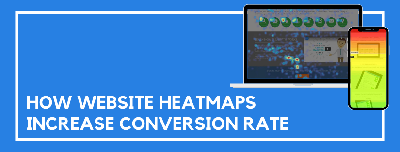
Before we can use heatmaps to increase our conversion rate, we need to understand what a heatmap is. A heatmap is a visual representation of data. On a heatmap, values get displayed as a color. Red displays the hottest, most popular, and highest values. Whereas blue and purple show the coolest, least popular, and lowest values.
There are different types of heatmaps. The most common types show click data, mouse movement, and scroll depth. Each of these heatmaps start with a screenshot of the page that is gathering data. The data is then displayed as colors that are overlaid on the image. That allows you to visualize the data while viewing the page. The data collected varies depending on the type of heatmap.
- Click Data Heatmap: This displays anywhere people click on the page. The click data is visible even if the element wasn’t interactive.
- Mouse Movement Heatmap: This displays where people move their mouse on the page. This is a good indicator of where site visitors are looking and what elements draw the most attention.
- Scroll Depth Heatmap: This displays how far down the page people scroll. This is a good way to determine how far most visitors see on the first page load. It can also help you see if anyone is scrolling down to view content at the bottom of the page.
(There are a few different conversion rate optimization tools you can use to track this data.)
What Can You Learn from Website Heatmaps?
Website heatmaps help you understand where to place your most important content. The data allows you to make intelligent content and page layout optimizations. Those optimizations will increase your conversion rate. Here are six insights you gain from heatmaps.
Optimize Content Length
Do people scroll to the bottom of your 3,000 word article? Do they scroll on shorter articles? Take a look to see where they stop scrolling. Once you understand how far people scroll, you can aim to keep your articles at or below that limit. That way, any call-to-actions at the bottom of the page will be visible to readers before they leave.
Improve Menu Item Placement
Looking at heatmaps can help you identify what menu options are being clicked. Does the order of popularity match the order they appear? If not, you might want to rearrange the menu so the popular items are easy to find. And is there an item that nobody clicks? Try renaming or relocating that item. If it isn’t important to your audience, and no one clicks it, it might not deserve space on the main menu.
Confirm Call-to-Action Visibility
Is your main call-to-action displayed in an area people see? It should be above the fold. What that means, is you want it displayed in the first window people see when they visit your site. People shouldn’t need to scroll to click your call-to-action button. Looking at a scroll heatmap will give you this data.
Better Determine Split Test Winners
Heatmaps can help you make more sense out of split test data. Looking at a heatmap of each variation will give you a visual indicator of how the versions differ. How did the changes impact the user experience?
Intelligently Redesign a Page
Before you redesign a web page, take a look at the heatmap data. Are there any elements being clicked that aren’t clickable? Maybe in the next version you need to incorporate a way people can click and view more details on that item. What about the mouse movements and scroll maps? Is the attention going to the key areas as you had planned? If not, determine what elements are distractions and plan to remove or rearrange those items.
Optimize Mobile Usability
Look at the difference between mobile and desktop. This will be especially important with the scroll depth heatmap. Take a look at where the fold is on mobile. It’s likely much higher than on the desktop version. Is your call-to-action button still above the fold on mobile? You’ll want to also take a look at what gets clicked on mobile. The priorities may differ from desktop users and that may cause the clicks to differ as well.
In Summary
Don’t only collect heatmap data, analyze it. Looking at it allows you to visualize improvements. Oftentimes, finding improvements in heatmaps is far simpler and faster than in tables.
Do you want to listen to this article? Here’s the podcast episode: